


Last week, Google hosted their developer festival, Google I/O 2018, which took place at the Shoreline Amphitheatre in Mountain View, California. Google employees from across its different departments held sandboxes, codelabs, office hours and also took to the stage to share hands-on advice on a range of different topics.
The content shared wasn’t just for developers though, and Google even highlighted the key talks for SEOs that would be relevant for gaining technical SEO insights. After the excitement of hearing from John Mueller at BrightonSEO, the DeepCrawl team couldn’t resist an opportunity to learn from more Google experts. We decided to listen in on some of the key sessions and took down the key points that will be most useful for search marketers.
Here are the talks we covered:
- Web performance made easy
- Deliver search-friendly JavaScript-powered websites
- What’s new in Chrome DevTools
- PWAs: building bridges to mobile, desktop, and native
Web performance made easy – Addy Osmani & Ewa Gasperowicz

Talk Summary
In this talk, Engineering Manager, Addy Osmani and Developer Programs Engineer, Ewa Gasperowicz, gave behind-the-scenes insights into how the Google team used Lighthouse to improve web performance, and walked us through their key challenges and the process they implemented, step by step.
See the full video of the talk here.
Key Takeaways
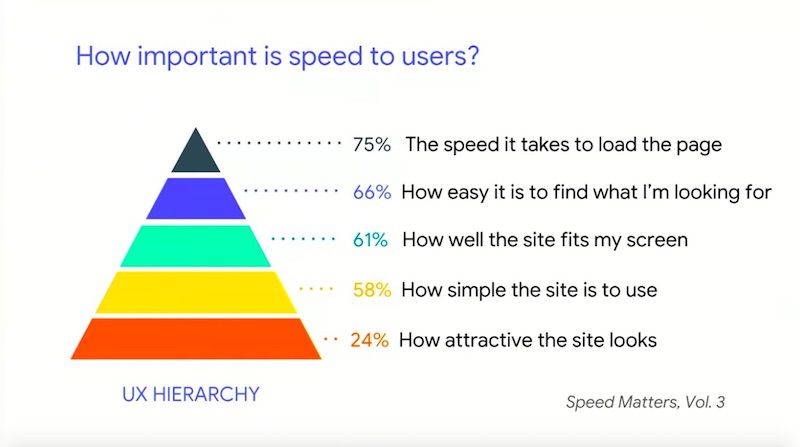
- Speed is the most important factor for UX because a user can’t do anything on your site until it loads
- Google has launched new Lighthouse audits to help you optimise your site for speed and performance
- ‘Low-hanging fruit’ fixes to start with that have little chance of breaking anything – minimise code (including removing white space) and implement caching
- Remove unused or unnecessary code and downloads to reduce page bloat
- To tackle JavaScript – perform JS bundle auditing and implement code splitting to only serve JS to users as and when they need it
- Huge file size savings can be found in converting gifs to video formats
- You can adapt what you serve to users depending on their internet connection e.g. serving video for a 4G connection but a static image for a 2G-3G connection
- Use link rel preconnect, preload and prefetch to help the browser prioritise what to fetch rather than it making its own decisions
- Implement critical path optimisation to improve performance of the elements that matter most in the user journey
- You can predictively optimise key elements and pages by using machine learning to map out the most likely user journeys
Ewa started things off by stating that the internet gets heavier every year, and the biggest contributors are images and JavaScript.
She also explained that speed is the most important UX issue because you can’t do a lot or derive any value from a page until it has finished loading.
To help with page speed and performance optimisation, Google has launched new Lighthouse web performance audits to help site owners know where to start with their optimisation efforts.
Announcing… new Lighthouse Web Performance Audits!
JavaScript boot-up time is too high
♀️ Avoid multiple round-trips to any origin
<video> should replace animated GIFs
⚡️ <link rel=preload> key network requests
and many more! https://t.co/x758s52E0w #io18 pic.twitter.com/y63cdRSRiO— Addy Osmani (@addyosmani) May 10, 2018
Using Lighthouse to optimise the Oodle Theatre feature
To show the best way to use the Lighthouse reports, Ewa and Addy detailed the process they went through for improving performance for Google’s Oodle Theatre feature. They managed to dramatically increase its performance score from 23 to 91. Here’s exactly how the Google team did it:
Challenge #1 – Remove unnecessary resources without affecting overall performance
The easiest thing to remove is usually the things that do nothing i.e. elements that don’t contribute to the code such as whitespace and comments.
The solution:
- Minimise code – elements that don’t contribute are highlighted in the ‘Minify CSS’ and ‘Minify JS’ Lighthouse reports
- The Google team used webpack to address minification
Next is enabling text compression – Firebase hosting was useful for gzip compression - Now the code is nice and compact and ready to be sent to the user!
Challenge #2 – Make sure code wasn’t being sent twice
It’s crucial to make sure that code isn’t being sent more than is necessary for improved load time.
The solution:
- Use ‘Inefficient Cache Policy’ audit in Lighthouse – shows where to optimise your caching strategies
- Setting an Expires header so users can reuse items they’ve loaded before. Ewa recommends that you “cache as many resources as securely possible for the longest period of time possible.”
The solutions for challenges 1 and 2 were straightforward, these fixes were seen as “low hanging fruit with very little risk of breaking anything.”
Challenge #3 – Remove unused code which can be a burden on user load
For a long project with different dev teams working on it, things like orphaned libraries can get left behind. This is what happened to Google. Look out for legacy code which does nothing for the site.
The solution:
- Use the Lighthouse ‘Unused CSS Rules’ report – this helped Google rediscover old, unused code within their bundle
- Use the Coverage tab in Chrome DevTools to highlight unused bytes of data
- Next, it’s time for a sanity check – performance may be up but what about UX? Removing code is never risk-free, it’s always important to check for potential visual regressions. Have proper workflow testing in place to guard against this.
Challenge #4 – Eliminate unnecessary downloads which cause bloated pages
When dealing with bloated pages, you need to measure the value and impact of all assets regularly to reduce the number of requests. As Addy explained, “the fastest request is the one that is not made.”
The solution:
- Make an inventory of all assets used to then measure their impact
- Use the Lighthouse ‘Detect Enormous Network Payloads’ report – Google found almost 3MB of this being shipped down
- Audit JavaScript bundles – the team used the webpack
- Bundle Analyzer to highlight excess JS being parsed, next they used import-cost plugin for Visual Code to analyse the cost of every module being imported, and finally they used BundlePhobia
All of these fixes resulted in 2.5MB of code saved for Oodle Theatre, and a 65% smaller file size.
Challenge #5 – JavaScript boot-up time is high
According to Addy, “JavaScript is your most expensive asset” because of the time it takes to download, parse, compile and execute it. This process is fine for the processing power of high-end desktop, but what about the average mobile?
The solution:
- Check Lighthouse ‘JavaScript Boot-up Time’ report
- Speed up the JavaScript handling process by code-splitting, so you’re only serving relevant sections to a user at a time as they need it
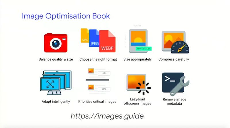
Challenge #6 – Dealing with unoptimized images
As was highlighted in the talk introduction, images are one of the biggest burden on internet weight. Many sites and features, including Oodle Theatre, have unoptimized images that are large, inefficient or unnecessary.
The solution:
- Utilise responsive images
- Use the Lighthouse image audit reports – Google found that their main issues were size and not using the newest image formats
- Use optimisation tools such as ImageOptim and XnConvert
Automate the process by adding libraries to your build process – this means images added in future will be optimised automatically - What about animated content such as gifs? You should switch to a video format. Google used FFmpeg for converting the Oodle Theatre homepage gif (which saved 7MB!)
- Adapt what you serve to users depending on their internet connection e.g. 4G ‘get’ <video> and 2G-3G ‘get’ static <img>
- Use the Lighthouse ‘Offscreen Images’ report for the issue of loading offscreen images (e.g. carousels/sliders) or the Network panel in DevTools. Try lazy-loading these images instead so they will be fetched on demand.
For further reading on image optimisation, take a look at Addy Osmani’s eBook on the topic.
Challenge #7 – Resources being discovered and being shipped down to the browser late
Rather than the browser making its own decisions about what to load, as authors of the page we should be telling the browser what’s most important to us to help it prioritise what to fetch.
The solution:
- Use <link rel=preconnect> to connect to critical origins of a page
- Use <link rel=preload> for assets needed for the current page
- Use <link rel=prefetch> for assets needed for future navigation
- Host things like Web Fonts yourself for maximum control – self-hosting also means you can make the most of link rel=preload
The Chrome team have been working on a new experimental feature called ‘Priority Hints’ which tells the browser how important resources are. It includes the new attribute of ‘importance’, and the new values of ‘low’, ‘high, and ‘auto.’ This will help with de-prioritising non-critical styles, images etc.
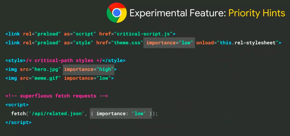
Priority Hints is coming to Canary soon.
Challenge #8 – Invisible text while web fonts load
Users are left with blank spaces when Web Fonts are only loaded once all of the HTML and CSS is loaded first for the page request.
The solution:
- Use the ‘Avoid Invisible Text While Web Fonts Are Loading’ audit in Lighthouse to highlight where this is happening
- Use the new feature called ‘font-display’ to have more control of how Web Fonts will render or fall back, which has the values ‘swap,’ ‘optional,’ ‘block,’ ‘fallback,’ and ‘auto’
Challenge #9 – Render-blocking scripts and external stylesheets blocking first paint
Requesting external stylesheets and render-blocking scripts will mean that your site will be delayed from being visually accessible.
The solution:
- Perform critical path optimisation to render critical resources before waiting for external stylesheets to arrive
- Inline critical styles in <head> and preload/async load the rest later on
- Split out scripts and mark the unnecessary ones with the defer attribute or lazy-load them
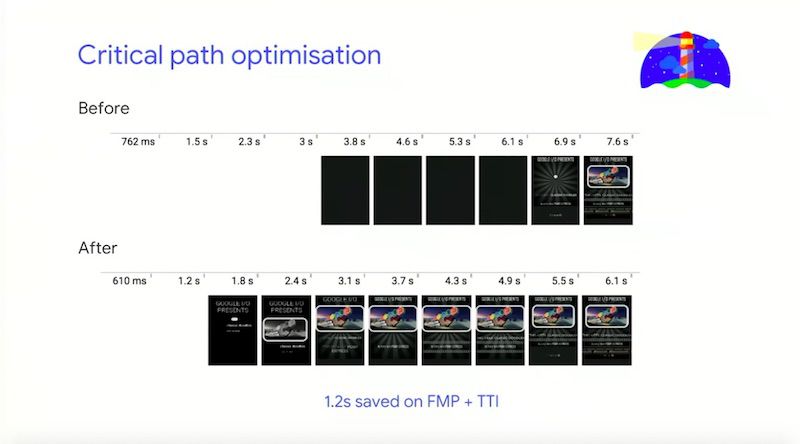
For the Google team, this phase shows just how important it is to design for performance from the outset so you don’t run into issues later
For further information, be sure to take a look at our BrightonSEO event recap with detailed notes on Bastian Grimm’s talk which gave advice on critical path optimisation.
Google’s whole process
To explore Google’s site speed and performance optimisation process in more detail, take a look at the Google Oodle demo in Github to see how the team technically implemented all of these changes.
The team were very happy with the performance score improvement (23 to 91), but their goal wasn’t to make Lighthouse happy, it was to make the user happy.
Ewa suggests that TTI (time to interactive) and Perceptual Speed Index are good metrics to act as proxies for seeing the impacts for user experience.
Nikkei case study: Scaling up the optimisation process
The Oodle Theatre was a manageable size, so how do we scale this process up for larger businesses? Addy demonstrated just how this can be done by sharing a case study for Nikkei, Japan’s largest media company with around 450 million users.
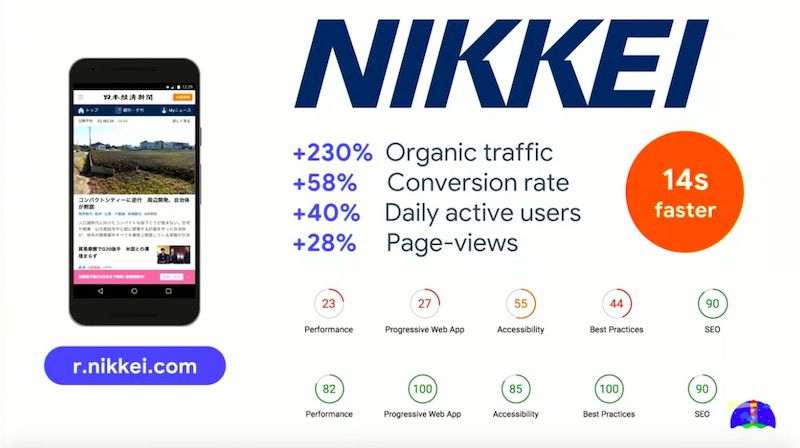
Here’s what Nikkei implemented to optimise performance:
- Compression
- HTTP caching
- Image optimisation
- Lazy-load non-critical resources
- Pre-resolve origins for DNS
- Have a fast Web Font loading strategy
- Route-based JavaScript chunking
- JavaScript bundling (webpack, RollUp)
- Serve ES2015+ to modern browsers
- Service Workers
- Prefetch
- Inline critical-path CSS in(this shaved 1s off time to first meaningful paint)
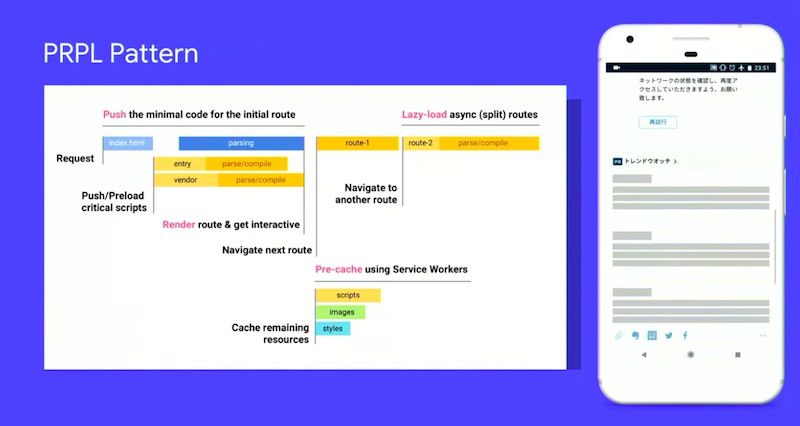
- PRPL pattern – Push, Render, Pre-cache, Lazy-load
Machine Learning & Web Performance: The Future
It’s hard for humans to correctly guess what the user wants in order to prioritise your site’s resources to best suit them, and it’s also difficult to scale these predictions across an entire website. We need to analyse data-driven user experiences with machine learning.
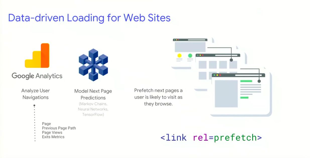
How this works:
- Use the GA data API to predict how users navigate between pages navigations (taking metrics like URLs, exits, next top page, likelihood of visiting next top page etc.) Check this out for yourself here.
- Use this data to improve page load performance, which is much more reliable than manually making decisions on what to prefetch, preload etc. You could also go more granular and prefetch individual resources rather than entire pages.
Addy announced the release of Guess.js, which is a project focused on data-driven user experiences for the web which hopes to inspire us to use data to improve web performance.
What does Guess.js provide out of the box?
- A GA module for analysing user navigation
- A parser for popular frameworks, allowing you to map URLs back to frameworks
- A webpack plugin to perform machine learning on this data to bundle, cluster and prefetch JavaScript for popular pages as users navigate through your site
- Experimental support for applying this to static sites too
We were then treated to a demo of Guess.js in action to see exactly how it works.
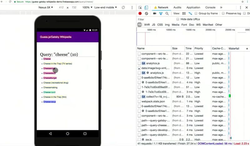
The network panel showed the prefetching of pages which are labelled as ‘high confidence’ which are determined as most likely to be accessed next. This means that the highest confidence next pages in the journey are loaded quickly.
Deliver search-friendly JavaScript-powered websites – John Mueller & Tom Greenaway

Talk Summary
John Mueller and Tom Greenaway have a lot of experience in helping developers ensure websites are indexable in search engines. In this talk they answered questions about whether search engines see all pages in the same way, if some pages and sites are more complex than others and what it takes for modern JavaScript-powered sites to be indexed. On top of this, John and Tom had a bunch of exciting announcements that they shared during the talk.
See the full video of the talk here.
Key Learnings
- Google only analyse anchor tags with a href attributes.
- The rendering of JavaScript-powered websites is deferred until Googlebot has resources available to process that content.
- Make sure that key details aren’t missed after the first wave of indexing because they’re only being rendered client-side.
- Dynamic rendering is the principle of sending normal client-side rendered content to users and fully server-side rendered content to search engines and other crawlers that need it.
- You might want to use dynamic rendering on sites with a high churn of content (like a news site) which requires quick indexing.
- Google have launched rendered HTML within the Mobile-friendly test so you can review the HTML after rendering with Googlebot smartphone.
- An aggregate list of loading issues issues during rendering is going to be included in Google Search Console.
Google and JavaScript
There has been an element of mystery as to what gets indexed and what doesn’t, especially with regards to JavaScript. Tom and John pulled back the curtain a bit to reveal some pieces of information about how Google sees the web.
The talk was about modern JavaScript-powered websites that use frameworks like Angular, Polymer and React or Vue.js. Although these frameworks can make things simpler for developers, they can make it more difficult for search engines to crawl and index these pages, especially if they use a single page application which is devoid of content in the HTML.
What do JavaScript-based sites mean for search engines?
Google has found over 130 trillion documents on the web (as of July 2016). Given the scale of the web, indexing all of its content is a really complex task. A crawler is needed to power this index.
In order for Google to crawl a page it should have:
- Reachable URLs – using robots.txt specifying which URLs to crawl and which to ignore and should include a link to a sitemap with a list of recommended URLs to crawl as a starting point.
- Duplicate content – Google needs to understand which URL is the original among a duplicate set, which can be specified using a rel canonical.
- Clean URLs – AJAX complicated the ability to have clean URLs, as pages could fetch JavaScript which could get new content form the server with reloading the browser page.
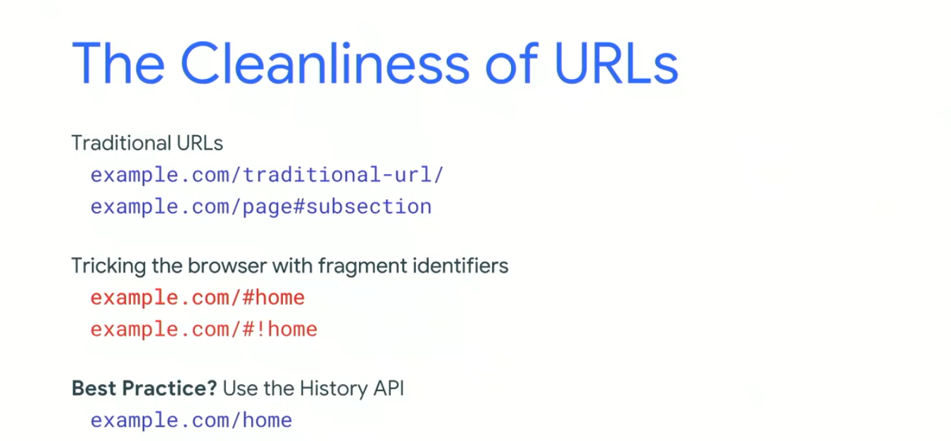
The fragment identifier was then invented for deeplinking into the subsection of a page and after that the hashbang (!#) came along to differentiate between a traditional URL using the fragment identifier to link to sub-content and a fragment identifier being used by JavaScript to deep link to a page.
Now the History API gives us the best of both worlds: dynamically fetched content with clean URLs. Google no longer indexes the fragment identifiers and discourages the use of hashbangs.
How do search crawlers find links?
Google only analyses anchor tags with a href attributes. If a site uses JavaScript to navigate a page, you need to ensure that they, too, are using anchor tags with a href attributes. Only the anchor tags will be followed for linking.
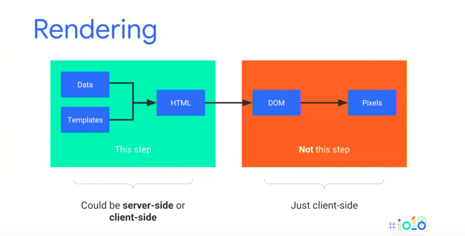
Rendering is missing step between crawling and indexing
In the old days of the web, crawling and indexing was enough to find all of the content on the web. Now, with an increasing number of JavaScript based sites, search engines need to render the page in order to discover all of the content.
If a site is pre-rendered server-side, this is fine for Google to crawl and index, but if this is done on the client side it presents a challenge.
Google’s Knowledge Graph maps out how more than 1 billion things in the real world are connected and includes over 70 billion facts between them.
How do crawling, rendering and indexing connect
The three steps of crawling, rendering and indexing run in a cycle and ideally we want them to run instantly. This isn’t going to be possible with client-side rendering.
What does Googlebot do in this situation? Googlebot includes its own renderer which is able to run when it encounters pages with JavaScript, but this is resource-heavy.
The two-phase indexing process
“The rendering of JavaScript-powered websites is deferred until Googlebot has resources available to process that content.”
This means that Google runs some initial indexing on a page after crawling but doesn’t render the page immediately as Googlebot doesn’t have infinite resources. Google renders the page when they have the resources available and then the content is indexed further.
What does this mean for JavaScript-based sites?
As a result of this two-phase approach to indexing, it is important for JavaScript-based sites to make sure that key details aren’t missed after the first wave of indexing because they’re only being rendered client-side, like: missing metadata, incorrect HTTP codes or lost canonical tags.
It’s worth bearing in mind that not all content needs to be indexed. Ask yourself, do the pages I care about from the perspective of content and indexing use client side rendering?
Different types of rendering
- Client-side rendering – Traditional state where JavaScript is processed on the client, either the browser or on a search engine.
- Server-side rendering – The server processes the JavaScript and serves mostly static HTML to search engines. This has speed advantages, especially for slower connections and lower-end devices. For both of these Google indexes the state as ultimately seen in the browser.
- Hybrid rendering – Pre-rendered HTML is sent to the client so you get the same speed advantages as server-side rendering. However, on interaction or after the pageload the server adds JavaScript on top. In this scenario Google picks up the pre-rendered HTML content.
Hybrid rendering is Google’s long term recommendation and where they think things will head in the future. However, this can be tricky to implement as most JavaScript frameworks make this difficult. Angular have built a hybrid-rendering mode with Angular Universal which makes implementation easier and John thinks that more frameworks will provide this functionality in the future.
Dynamic rendering – Is the principle of sending normal client-side rendered content to users and fully server-side rendered content to search engines and other crawlers that need it.
It is called dynamic rendering because the site dynamically detects if the requester is a search engine crawler (like Googlebot) sending server-side rendered content to the client or any other requester (like a user) who would receive the client-side or hybrid-rendered content. Dynamic rendering is not a requirement for JavaScript sites to be indexed.
How might you implement dynamic rendering?
For dynamic rendering John recommends adding in a new tool or step in your server infrastructure to act as a dynamic renderer.
There are two open source options to help you get started with dynamic rendering:
Puppeteer – A node.js library library that wraps a headless version of Chrome underneath.
Rendertron – Software as a Service that renders and caches content on your side as well.
How might the server infrastructure look like with dynamic rendering?
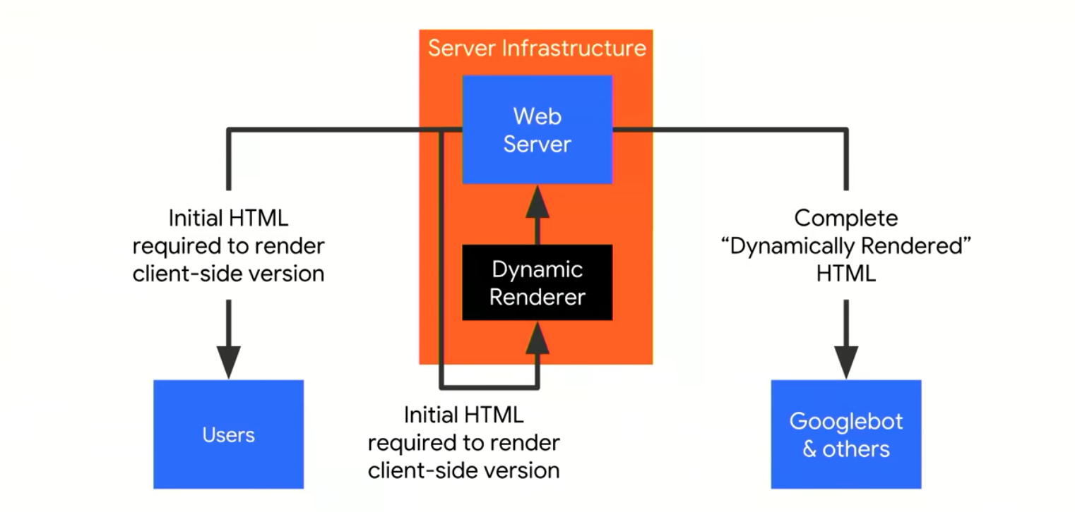
A request from Googlebot comes in and is sent to your normal server, then through a reverse-proxy it is sent to the dynamic renderer. There the complete final page is requested and rendered and is sent to the search engines.
This setup could enable a website which is only designed for client-side rendering to perform dynamic rendering of the content to Googlebot and other appropriate clients without having to maintain a separate code base.
User-agent detection – The easiest way to detect Googlebot is in the user-agent string and a reverse-DNS lookup to be sure you are just serving to legitimate clients.
Device-focused detection – If you serve adapted content to users on mobile and desktop, you need to ensure that dynamic-rendering returns device-focused content. So Googlebot Smartphone should see the mobile version of your pages and the others should see the desktop version.
Googlebot uses Chrome 41 to render pages, which was released in 2015. This means that some more recent JavaScript functions aren’t yet supported by Googlebot (like arrow functions) and any APIs created after Chrome 41 won’t be supported. You can check whether something is supported by using services like Can I use….
When should I use dynamic rendering?
You might want to use dynamic rendering on sites with a high churn of content (like a news site), which requires quick indexing. If rendering is taking place client-side then it will be deferred and the new content might take a while to be indexed.
If you rely on modern JavaScript functionality (>Chrome 41), for example if you have any libraries that can’t be transpiled to ES5 then dynamic rendering can help. John recommends using proper graceful degradation so even older clients have access to your content.
Sites with a strong social media presence relying on social sharing. If these services require access to your content then it might also makes sense to use dynamic rendering too.
Implementation and maintenance of dynamic rendering can use a significant amount of server resources, so if you don’t have rapidly changing content then maybe it isn’t necessary.
A few recommended tools (including some new additions)
John recommends diagnosing rendering incrementally, first check the raw HTTP response and then checking the rendered version on mobile or mobile and/or desktop if you serve different content.
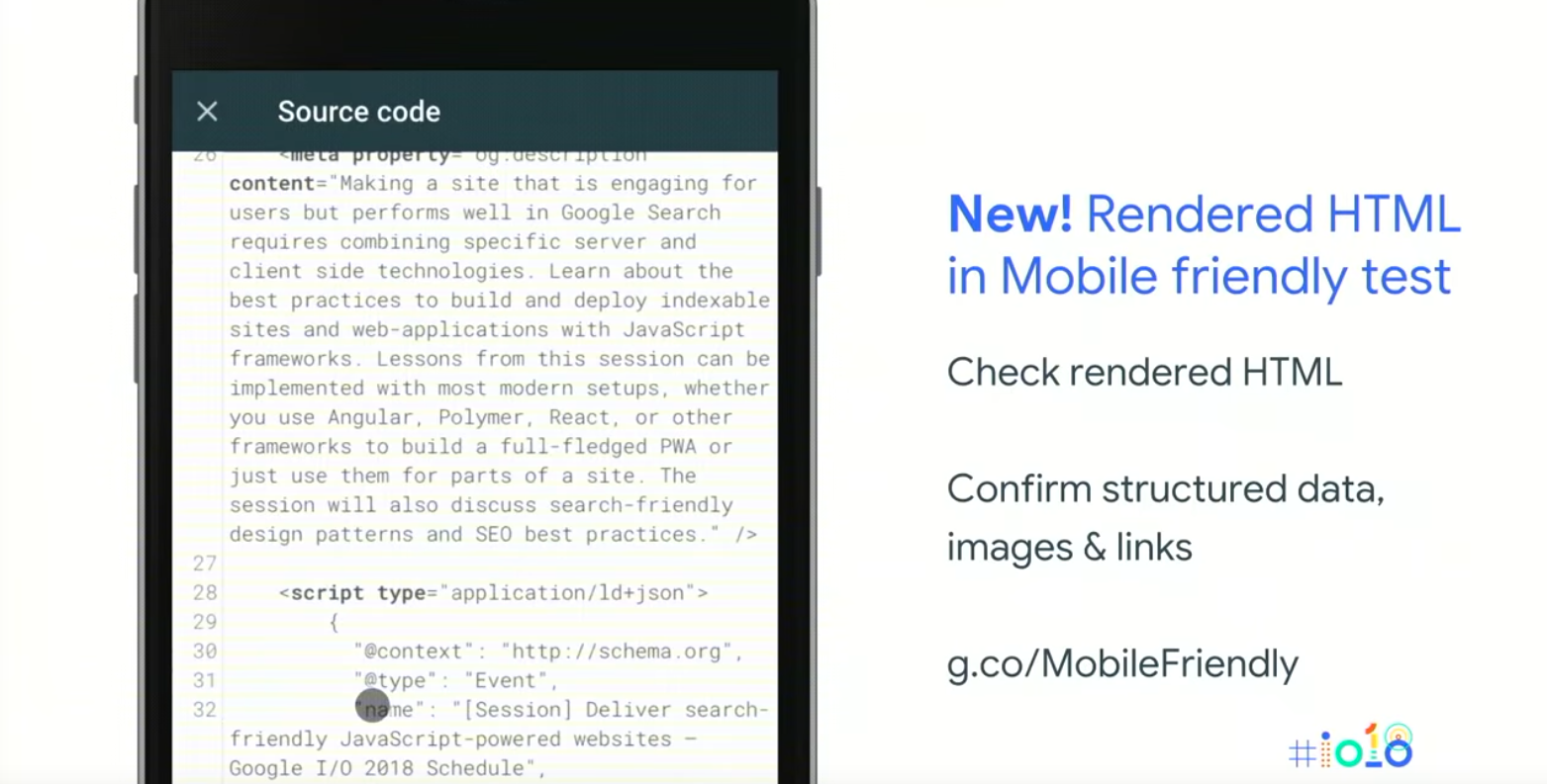
You can look at the raw HTTP response in Search Console by using Fetch as Google. This a great way to double check what is happening on your server especially if you’re using dynamic rendering. You can check how a page has rendered by using the Mobile-friendly test. If your pages render well here then there’s a high probability Googlebot can render your pages for search as well.
Google have launched rendered HTML within the Mobile friendly test so you can review the HTML after rendering with Googlebot smartphone. You can also find information about loading issues during rendering including all of the resources that were blocked by Googlebot. An aggregate list of all of these issues is now going to be included in Google Search Console. You can also find a list of the issues on desktop using the Rich Results testing tool.

You can also understand how your website performs with and without JavaScript rendering by using DeepCrawl’s new JavaScript Rendered Crawling feature. You can find out more about in our feature release post here.
Lazy loading images
Lazy loading images may be able to be triggered by Googlebot. If the images are above the fold Googlebot will trigger these automatically. If you want to be sure that Googlebot is picking up lazy loaded images you can wrap the image in a noscript tag or by using structured data.
Click to load patterns
Googlebot generally doesn’t interact with a page so things like infinite scroll, ‘tap to load more’ and tabbed navigation is unlikely to be picked up by Googlebot. However, you can preload the content and use CSS to toggle visibility on and off or you can just use separate URLs.
Timeouts
Googlebot has a lot of pages to crawl so slow and inefficient pages are likely to be crawled inconsistently. John recommends making web pages performant and efficient to avoid artificial delays.
No browser state
Googlebot wants to crawl pages as a new user, so it does so in a stateless way. Any API that stores anything locally would not be supported by Googlebot. If you do use any of these technologies then use graceful degradation to make sure you can view pages even if these APIs aren’t supported.
Search and JavaScript in four steps
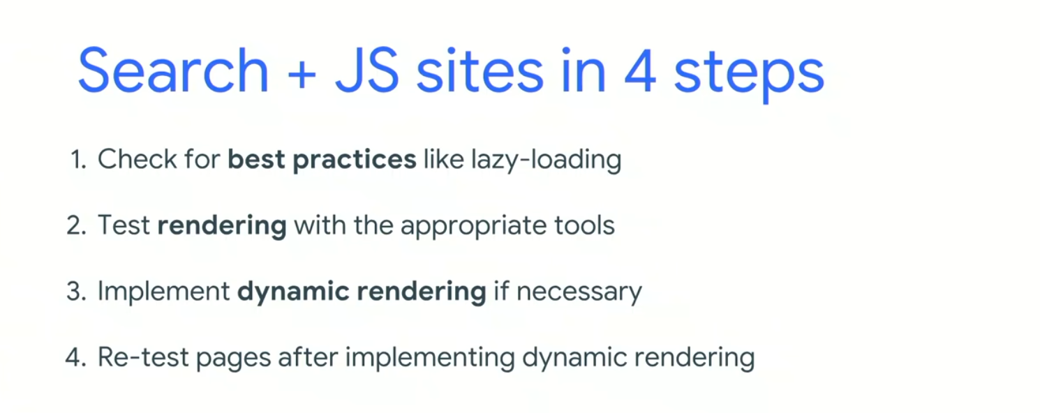
- 1. Check for best practices for things like lazy loading images
- 2. Test a sample (the templates) of your pages with the Mobile-friendly testing tool
- 3. Implement dynamic rendering if it is necessary
- 4. Re-test pages after implementing dynamic rendering
Future direction
Google wants to integrate crawling and rendering by using a more modern version of Chrome for crawling. It is believed that more services will render pages in the future, meaning dynamic rendering will be less critical.
What’s new in Chrome DevTools – Paul Irish & Jason Miller

Talk Summary
Googlers Paul Irish (Performance Engineer) and Jason Miller (Senior Developer Programs Engineer) got us up to speed with the latest features shipping in Chrome DevTools, in this Google.io session.
See the full video of the talk here.
Key Takeaways
- Don’t forget older – and awesome – DevTools features like the Copy function
- For JavaScript frameworks, give User Timings a go to see when things are actually rendered
- Use Local Overrides, it allows you to make great changes, prototype things and keep those changes across page loads, even for pages that aren’t on your site or that you don’t have access to
- Try editing your Lighthouse score with DevTools
- Check out the Eager Evaluation feature which guarantees no side effects and helps power more completions, as well as ASYNC/AWAITS and QueryObjects
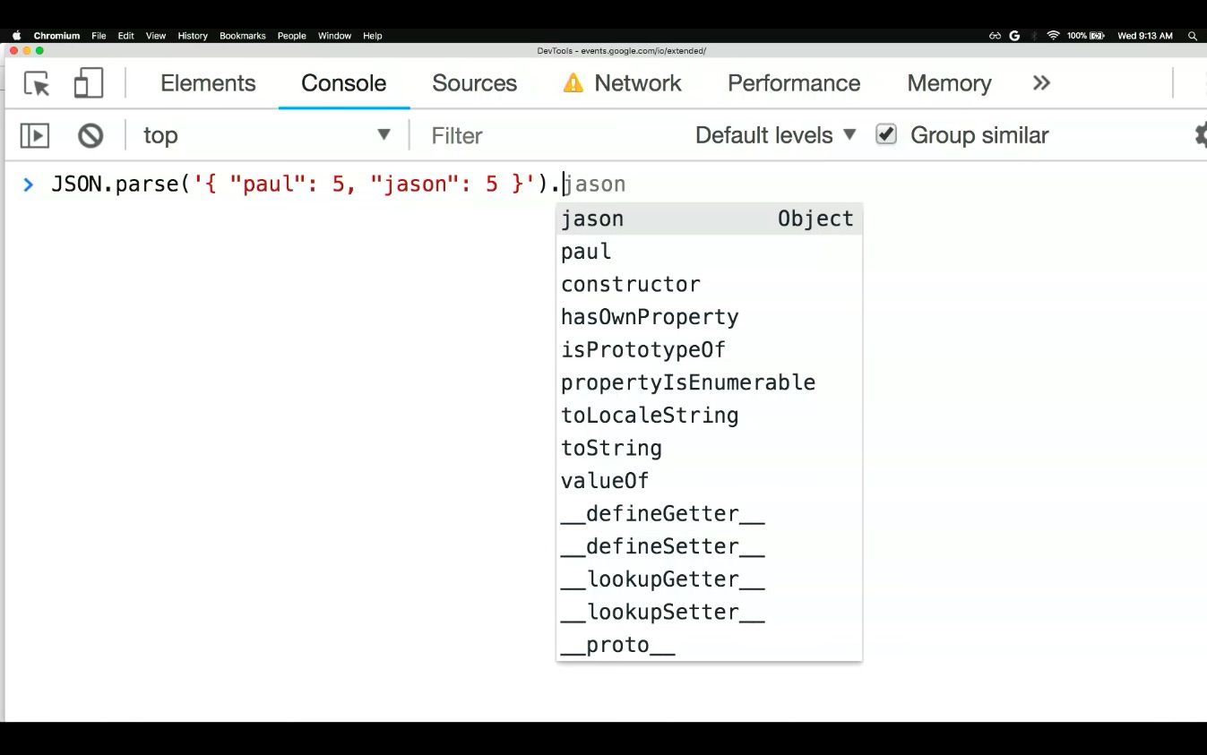
- The Debug Method has been updated, so you can now you can pass in native functions like query.selector, which will now pause as soon as any JavaScript is going to use that native method. You can also do it with alert, to find out who is alerting etc.
Intro
This session covers what’s been going on from the Chrome Dev Tools team in the past year in terms of features and functionality, focusing on Authoring, Accessibility, Performance and JavaScript.
Chrome DevTools
These are a group of debugging and web authoring tools built into Google Chrome, which can be used to set JavaScript breakpoints, understand layout issues, and get deeper insight into code optimisation. In short, they give developers a comprehensive path into their browser and web application alike.
Authoring

This is Google’s way of crafting a nice user experience for everyone who is enjoying their web content.
Some of you will remember Workspaces (AKA Persistence 2.0) like Git Checkout for editing, which have been helpful in the past for a fast iteration cycle. But if you want to amend pages that aren’t on your site/that you don’t have access to, you can use Local Overrides.
Local Overrides
This enables a lot of cool things, allows you to make great changes, prototype things and keep those changes across page loads! This is a stellar improvement as before, anytime you re-loaded a page, the changes you made in DevTools would be lost. Whereas now, if you’re ever thinking “I know I made a lot of changes today, but…what were they?” you can easily catalogue your work by accessing the pane* or opening up the menu to see the changes view.
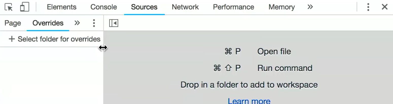
In order to set this up for the first time, you should put your overrides on your disk (anywhere) and make sure to click allow so that DevTools has permissions to work within that folder, as it’s not route.
*Shortcut=COMMANDSHIFTP
Network Search
There’s a new icon* to pull up a new search sidebar, searches through headers and their values. For example cache control headers which tell you if the browser is going to cache things locally.
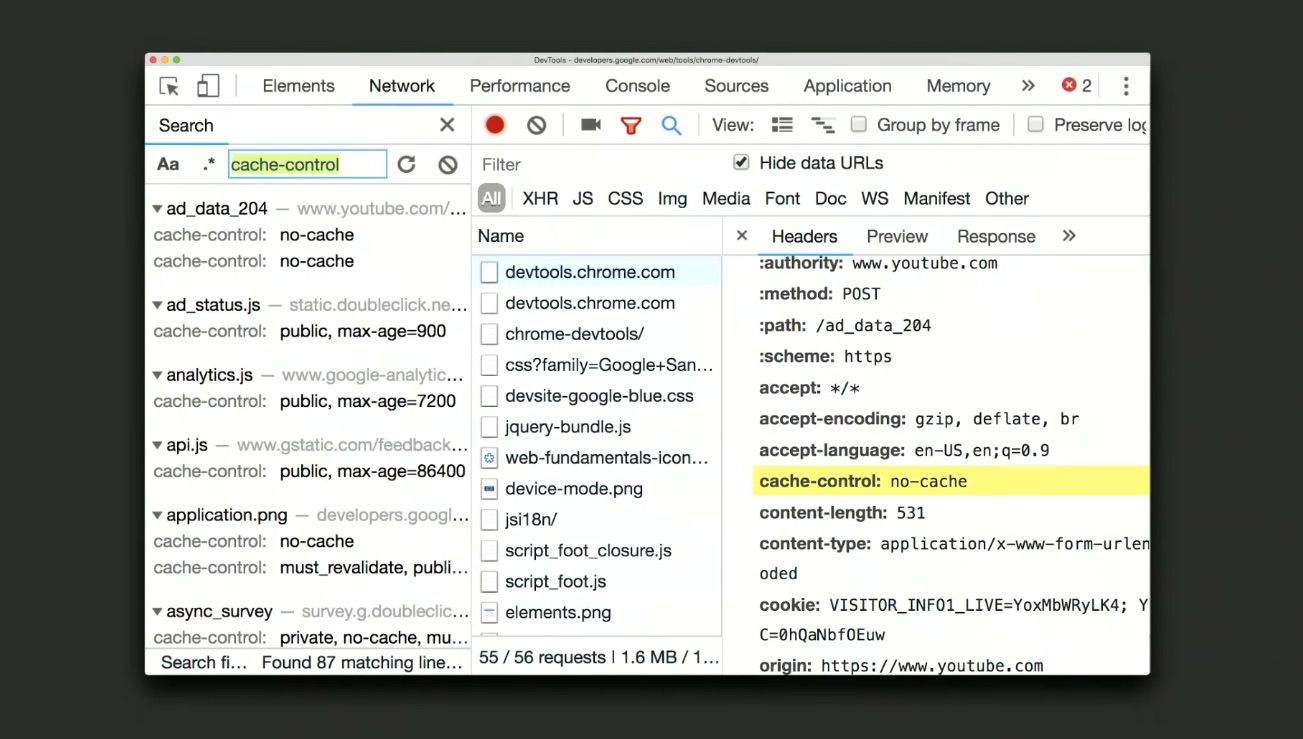
You can use this to find things like case sensitive search, RegEx based search, authorisation headers to know which of your requests are authenticated, cookies, CSP headers you name it!
*Shortcut=CTRLF/COMMANDF
Editing Lighthouse with DevTools: Use this to keep yourself away from the rocks and guide you toward other meaningful information, like a true lighthouse.
View Trace lets you dig beneath the lighthouse. Lighthouse records a trace, loads it, reloads it, with details about JavaScript etc, and they thought why not let people dig into the trace? This way you can look into the trace that resulted in any given Lighthouse score, which means you can figure out where your blockers are.
Here are a few things you could do to improve your score.
iFrames using site isolation which are positioned on different tracks, now as you select, each track will be updating in a multi-process view of sorts, like this:
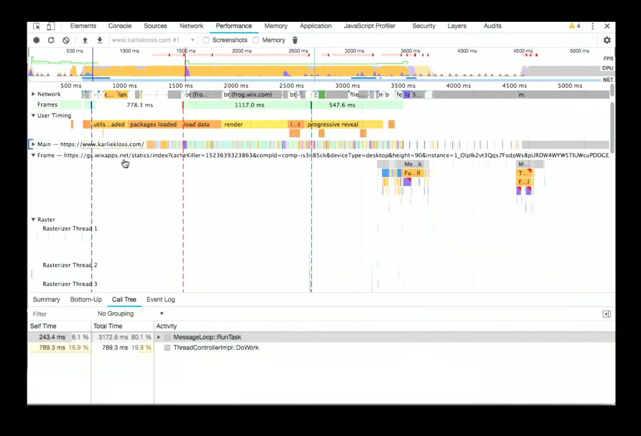
This enables another powerful feature, a number of JavaScript frameworks use User Timing to say when things started and ended (when they were rendered) which is talking about your components. You can select the User Timing track to see summarised data like this:
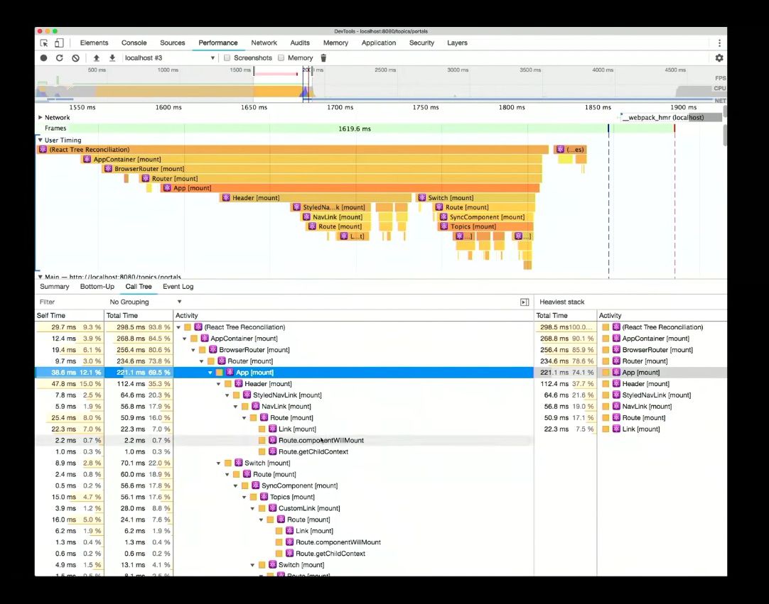
Having this structural profiling data come in via User Timing is great because it saves time, otherwise you’d be writing all of the start and end timings yourselves – whereas here DevTools is doing the heavy-lifting for you.

After a brief interlude of jokes, including the images of self-driving cars above, we learned about ASYNC/AWAIT, a part of everyday JavaScript at this point, which looks like this:
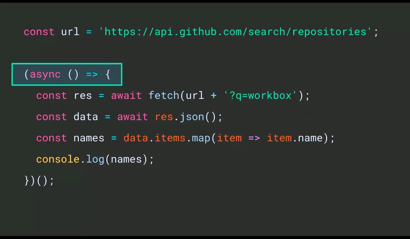
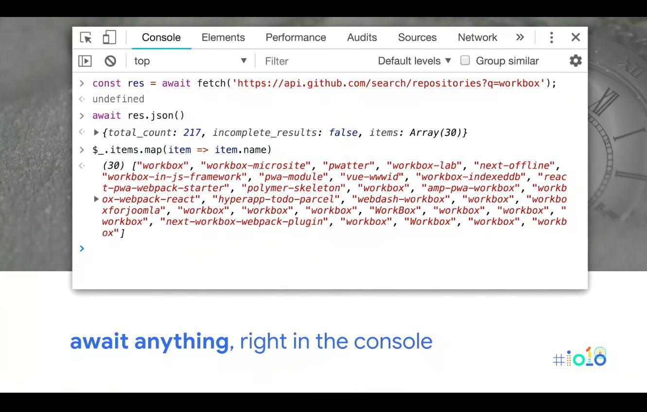
Which runs asynchronously when it gets invoked and is fine for app development but is a little annoying in the console. But now, the console has gained support for top level AWAIT – no wrap around, no shenanigans! Bye bye clever hacks: step through line by line, an ASYNC flow with no wrapper functions etc.
Moving beyond what DevTools looked like last year:
And onto today:
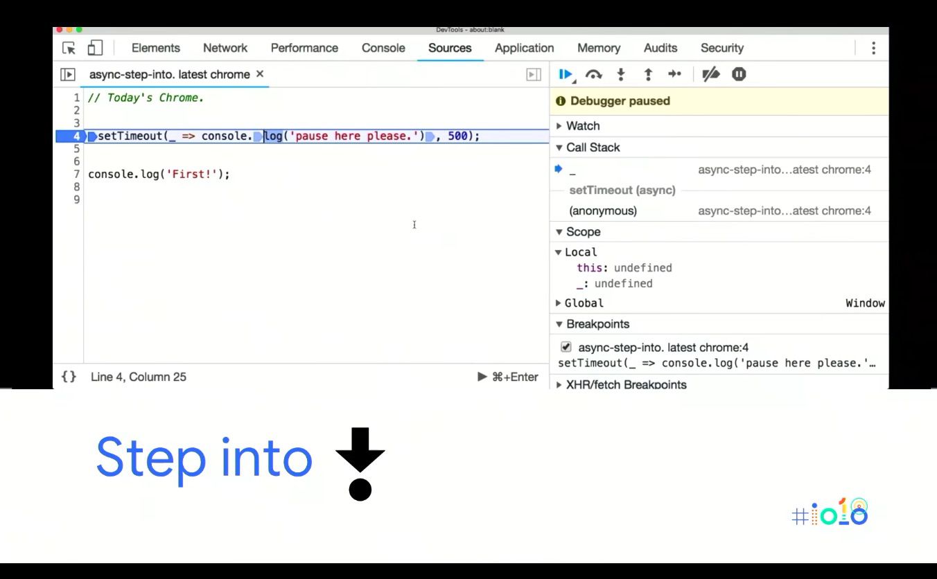
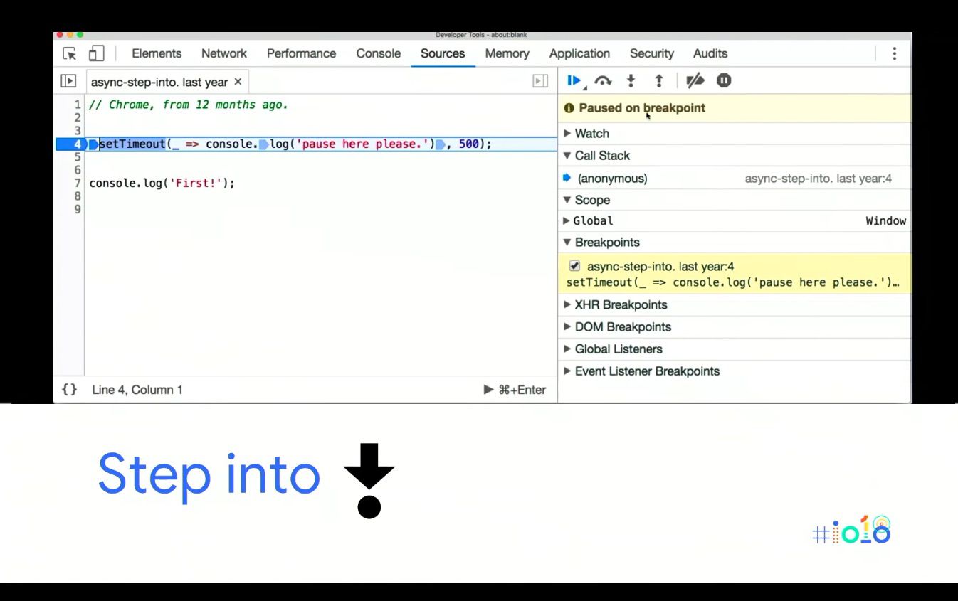
As you can see, the ASYNC first mentality has come through to the debugger. One of the biggest changes is when stepping into ASYNC functions like a setTimeout until now they’d pretty much step over it (especially if it’s a native).
If you click step into the next function call you end up on Line 7, AKA it steps past it. Now if you click into that you fall into the function, so it’s an ‘ASYNC Aware Into.’
With new ‘ASYNC Aware Step Into’ you can step into the worker creation and it drops you off on the first line of the worker you created, like so:
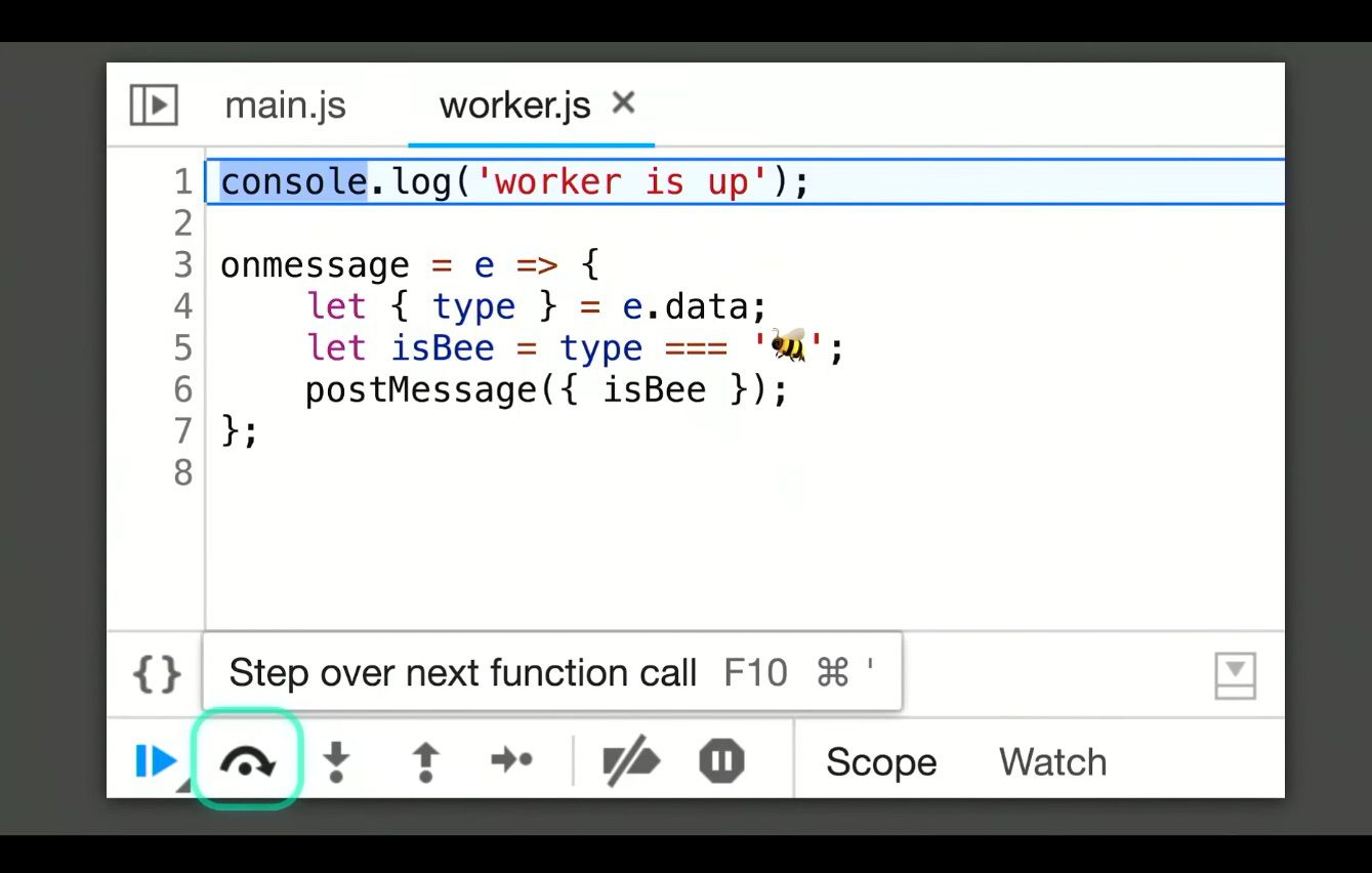
You can also step into the post message call to the worker and it will step across the thread boundary and you can go from the post message to the worker back to the main thread, like there was no thread boundary at all!
Sneaky Things in the Console
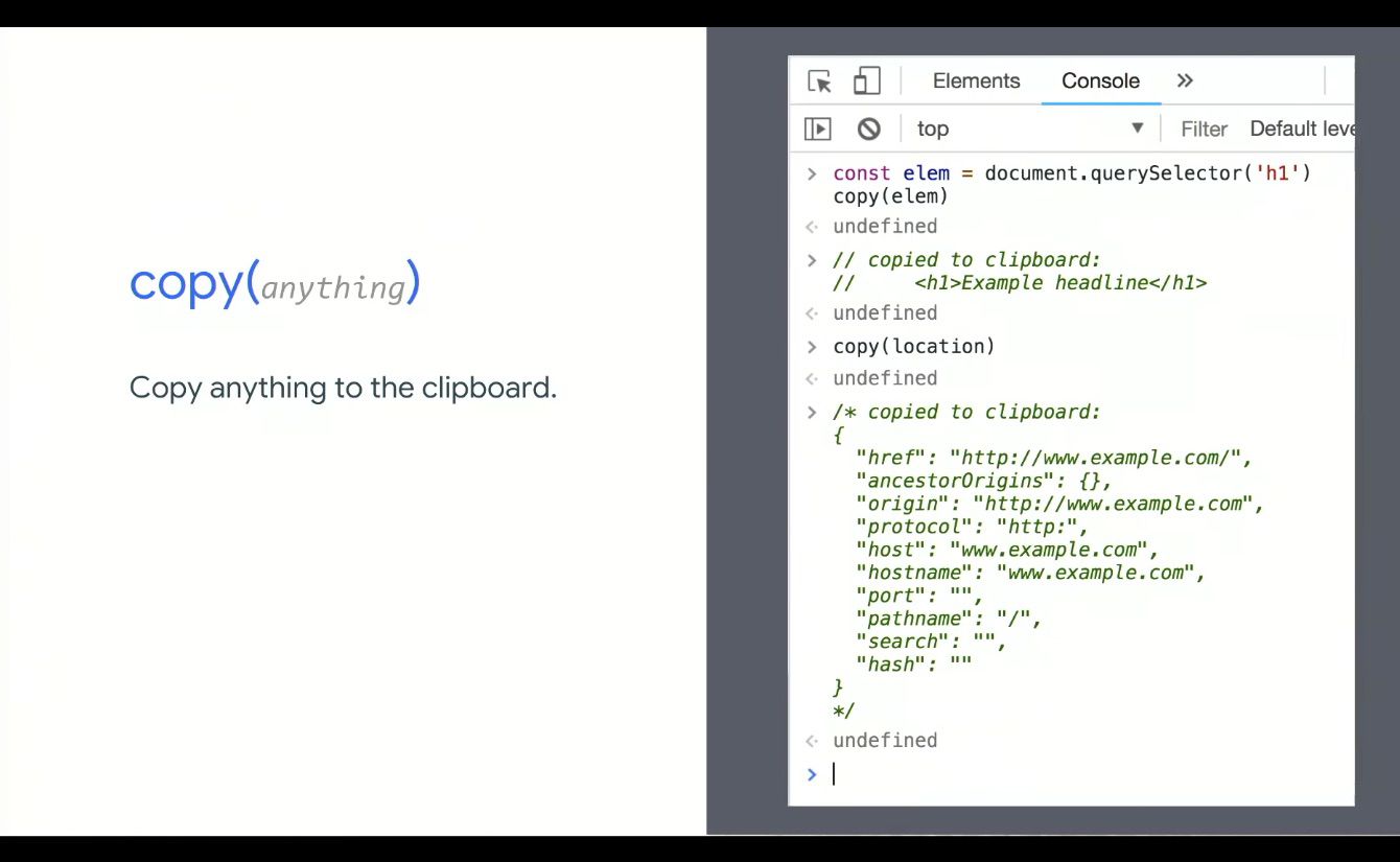
Though the Copy feature is 7, 8 years old, we’re including it in case you missed it, as you can copy anything to the clipboard:
The Debug Method – that you can pass a function to – has also been around for a while, but it’s been updated and now you can pass in native functions (like query.selector). It will pause right inside of the function that you pass, but now it’ll pause right as soon as any JavaScript is going to use that native method. You can also do it with alert, to find out who is alerting etc.
One thing that’s brand new are queryObjects.
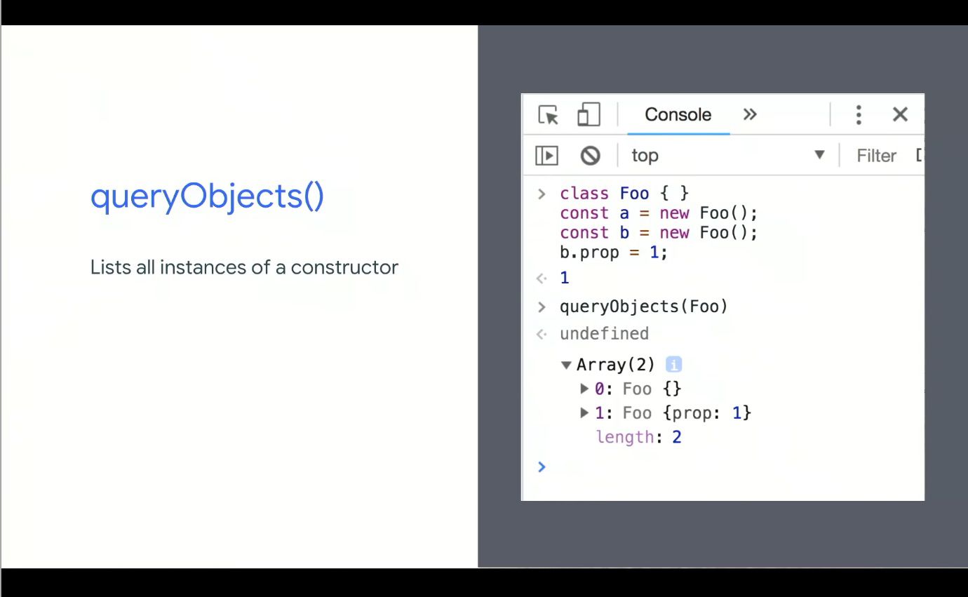
You can see all of the instances, across the entire JavaScript heap and summarising it. You can look at custom element constructors for example, and get them dumped right here.
Google is introducing a feature that they believe will be a game-changer: Eager Evaluation.
It can guarantee there are no side effects by adding in another mode in v8 where they attempt to evaluate code, but if they know it will change the outside state like the application the page other parts of the dom etc, they just bail.
Eager Evaluations can be used to power more completions.
Why not try it out for yourselves and have your completions upgraded? Grab today’s Chrome Canary pop into the Console settings and turn on Eager Evaluations and it’ll enable everything we covered above and below!
PWAs: building bridges to mobile, desktop, and native – Jenny Gove & Pete LePage

Talk Summary
In this talk, UX Researcher, Jenny Gove, and Developer Advocate, Pete LePage, explained the ways in which PWAs can create a truly positive experience for users on both mobile and desktop. They also gave some live demos showing how Starbucks, Spotify and even Google themselves are using PWAs for better web experiences.
See the full video of the talk here.
Key Takeaways
- PWAs allow us to improve the user experience we provide
- A PWA experience should have all the 4 principles of FIRE: Fast, Integrated, Reliable and Engaging
- Reduce friction where possible on crucial elements like sign in and checkout – using one tap and correct keyboard for input type, for example
- The PWA criteria: Web App Manifest, HTTPS and Service Workers. Test these with Google Lighthouse
- PWAs are a fraction of the size of a native app and can produce 100% of the capabilities
- Desktop is still growing too and shouldn’t be neglected – utilise PWAs to improve the desktop experience as well
Jenny started things off by describing that Progressive Web Apps (PWAs) “allow us to radically improve the user experience we provide.” She also outlined the 4 aspects that make a great experience for users, with the FIRE principal:
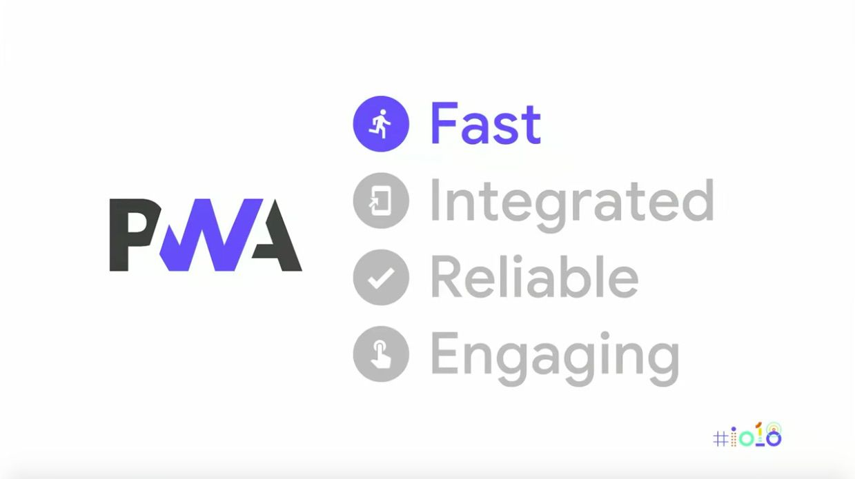
- Fast: The experience must actually feel fast
- Integrated: The experience must feel natural to the user’s device
- Reliable: The experience must always work so as not to destroy user trust, even when internet coverage is limited
- Engaging: The experience should be engaging from the user’s first run through to all future critical journeys
Tips for improving user experience on PWAs:
- Only intrude on the user with permission requests and sign ins where needed
- Checkouts and forms need improving to reduce friction – e.g. correct keyboard for input type, autocomplete attribute etc.
- Use placeholder and pre-cached content for improved site speed (e.g. navigations shouldn’t rely on the network, so use precaching to prevent pages being reloaded every time a new page is being loaded)
- For further tips on good mobile design, see this Google Developers guide
The FIRE PWA experience allows you to meet your users where they are in the context of where they live, work and play.
She also ran through the PWA criteria, which is as follows:
- Has a Web App Manifest (including “short_name” or “name”, “icons” and “start_URL”
- Is served over HTTPS
- Has a Service Worker with a fetch event handler
The easiest way to test the above is with Lighthouse.
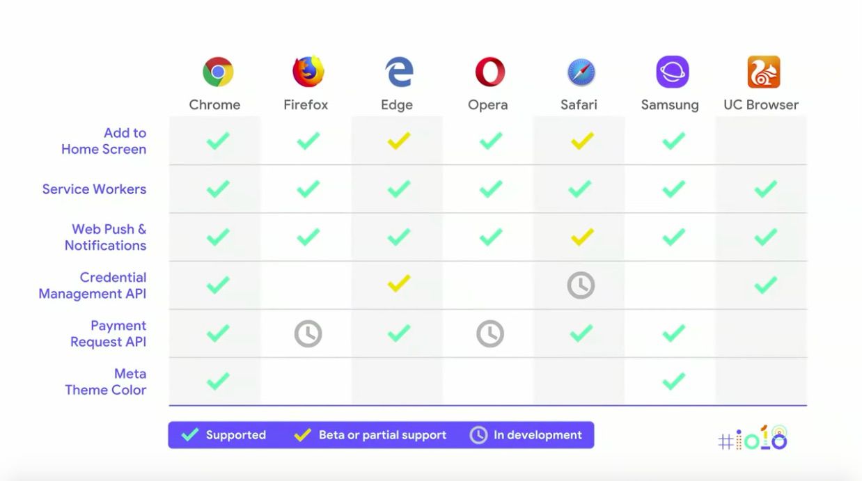
Pete went on to explain that the way to truly provide the FIRE experience is with Service Workers. Here is how Service Workers and PWA components are supported by all the main browsers:
To demonstrate first-hand the experience a PWA can create, Jenny and Pete gave some live demos of PWAs from Starbucks, Google and Spotify.
Live Demo of the Starbucks PWA
First up, Jenny gave a live demo of the Starbucks PWA, first without airplane mode then with airplane mode enabled. It allowed the user to continue their experience even when not connected (this even extends to payment experience i.e. caching of user payment details and using IndexedDB.)

Starbucks used:
- Workbox to help with pre-caching content and run-time caching
- The Credential Management API – meaning the sign in process is only one tap
- Attention to detail to create an engaging experience – using navigation stack and appropriate back button navigation
- Content-specific animations and messaging which provide feedback to the user (such as the order added confirmation) for an ‘alive’ feel

Starbucks’ daily and monthly active users have nearly doubled since launching this PWA and orders keep increasing. It’s especially successful because this experience works just as well on desktop too so users can order ahead from their computers.
Live Demo of Google’s PWAs
Next, Pete gave a live demo of some of Google’s PWAs, including Google search, maps and Bulletin.
The Google Search PWA allows users to ask questions when they’re offline and Google will then provide the answer once the user has reconnected.
The Google Search PWA used:
- Service Workers
- Background sync
- Push notifications
This reduced the number of external JavaScript requests by nearly 50%, and reduced user interactions delayed by loading JS by 6%.
He also showed Google’s Bulletin PWA in action, which is a way of sharing hyper-local stories. The main takeaway was that the PWA is the fraction of the size of a native app with 100% of the functionality.
Then he gave a demo of the Google Maps PWA, which was launched to provide a positive experience for users in limited network conditions. It remembers locations you’ve searched previously, even when you’re offline.
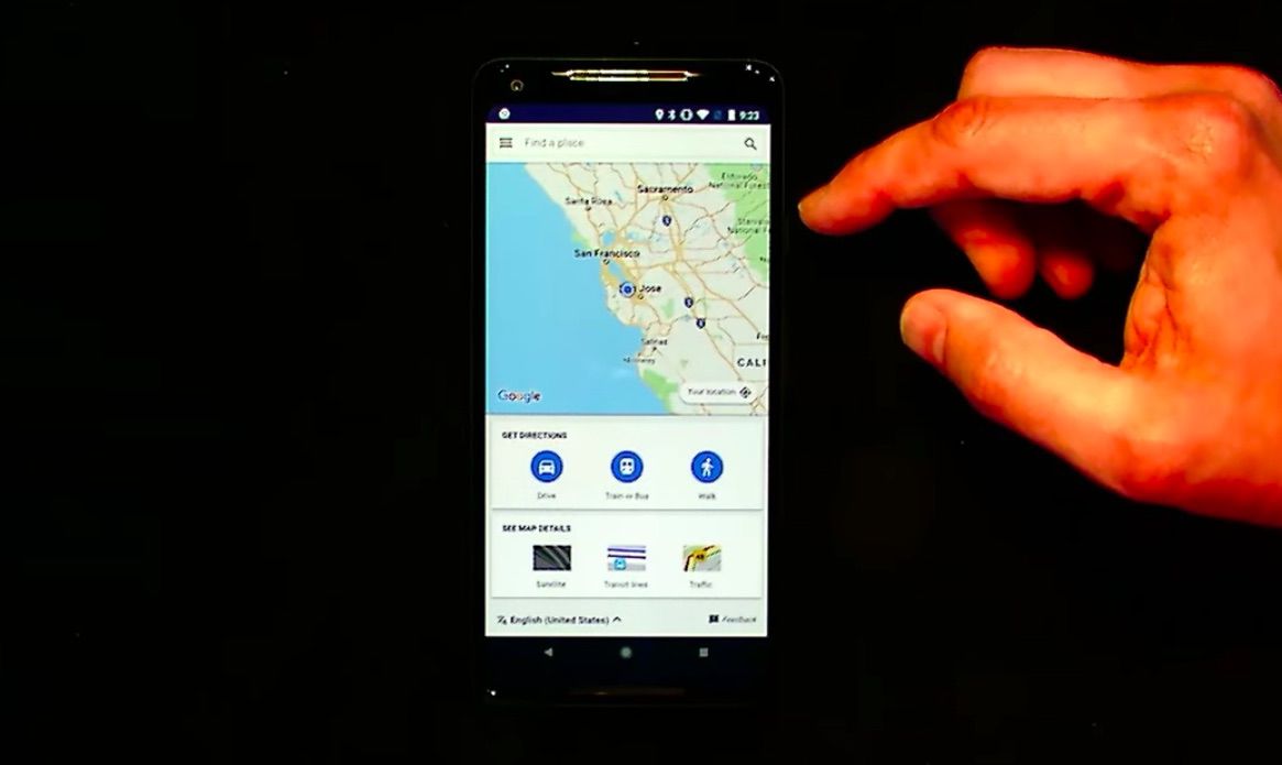
The Google Maps PWA:
- Inlined JavaScript, CSS and HTML templates
- Had its code refactored so the Service Worker will only run the code that’s needed (e.g. if the user doesn’t need directions, this isn’t loaded)
- Used Service Workers to cache the core app shell – which is especially useful for limited connectivity
- Stored each map tile in an IndexedDB table once it was loaded so the Service Worker could come back and regenerate a URL for each one
- Used the Layers panel in Chrome DevTools to identify elements that were off screen to be removed from the DOM
- Saved memory by reducing transparency and drop shadow
As much information as possible was put into the initial HTTP request to reduce the number of requests needed for the app to start, which was where the real success came from.
The new experience sees 20% more successful page loads compared to what was seen previously.
Live Demo of the Spotify PWA
PWAs aren’t exclusive to mobile, as Jenny went on to clarify. Mobile has been the main focus of development for PWAs, but desktop is still growing so it needs to be considered as well.
Desktop isn’t dead. It’s growing. Juuuust not as fast at mobile. #io18 pic.twitter.com/zXCwAQ5gpi
— Jamie at Google I/O (@Jammer_Volts) May 9, 2018
PWAs can also improve desktop experiences, and the installed, native feel of an app is key for the FIRE experience. This was demonstrated in a live demo of the Spotify PWA on desktop (Chrome OS.)
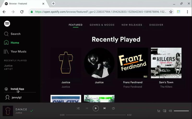
On desktop, PWAs show in the app window without tabs or the address bar. Just the app is shown, meaning the app window is optimised for the needs of apps with more flexible window organisation.
Design tips for responsive PWAs:
- Use up additional real estate on desktop by creating new break points for wider screens
- Consider landscape and portrait views
Additional tip: Future-proof your apps by using the “scope” property to define URLs to be considered within the app – if a user leaves this set of URLs you’ll be bounced out to a regular browser tab.

Thanks for reading our Google I/O 2018 recap, we hope you learned some valuable information to apply to your own business and to further your own learning. If you want to keep up to date with the latest Google developments, be sure to read our Google Webmaster Hangout notes and sign up to our newsletter to get the latest news in your inbox.
We also have some exciting news and an upcoming webinar to announce…
Learn more about JavaScript
If you enjoyed our webinar on mobile-first indexing with Bastian Grimm, you’re in for a treat with the one that followed in our series. Jon Myers spoke to Bartosz Góralewicz, Head of SEO at Elephate, to talk all about JavaScript.
With the knowledge gained from the JavaScript I/O 2018 session with John Mueller and Tom Greenaway, and so much focus on JavaScript in the SEO community at the moment, this webinar was an absolute must-watch for any search marketer. If you missed it, luckily we wrote up a recap including a full recording of the webinar, and we also shared Bartosz’s answers to all of the audience’s questions that were submitted.