
We know that making the internet accessible for everyone is fundamental to the rights of internet users. But what is the relationship of accessibility with search engine optimization? And how can SEOs use their position to ensure site accessibility is as good as it can be?
The latest installment of our webinar series looks at the importance of accessibility to SEO.
Joining Jon Myers from Ascending Media this past Thursday was Deepcrawl’s Technical SEO Analyst Ruth Everett and Account Director at Erudite Jessica James.
Read on for our digest of the presentation.
What is web accessibility?
At the topmost level, this is fairly easy to answer. It is the act of making sure websites are accessible and usable for everyone. Everett highlights that this means everyone needs to be able to:
- Perceive what is happening on a site
- Understand the information there
- Navigate the site
- Interact with the site
It also includes auditory, cognitive, physical, neurological, and visual usability.
Accessibility is important to ensure the millions of users with long-term impairments worldwide can use our websites. Everett also details a number of other types of impairments that can affect users, including:
- Temporary impairments – such as a user with a broken arm or someone recovering from surgery.
- Situational impairments – such as people on moving trains or with limited internet connections.
- Environmental impairments – such as being in a brightly lit room or in a place where users can’t play audio.
POUR – The four principles of accessibility
Everett uses the ‘POUR’ acronym to help remember the four principles of accessibility.
- Perceivable. Removing any barriers that a user may have when accessing your content. For example, clear and descriptive alt. text that can be read by screen readers.
- Operable. A website must be usable whatever device is being used to browse it. Users must have enough time to complete tasks. We need to avoid blinking or moving content, avoid alerts or pop-ups that can’t be minimized and not impose time alerts to complete tasks.
- Understandable. Being able to understand the information displayed on a webpage and the user interface, as well as being able to navigate the site. Eg. Copy should be easy to read, broken up with logical headings and bullets/lists with correct mark-up.
- Robust – A website must be able to be accessed and interpreted by different technologies and platforms, including screen readers. We must ensure there are no errors in code so pages are easy for assistive technologies to follow and understand. And we can use ARIA components to provide additional information to assistive technologies.
The intersection of SEO and accessibility
Everett points to data published by WebAIM which really highlights how issues of accessibility and SEO intersect.
Their research found that 98% of homepages have detectable access failures, while 97% of deeper content also failed accessibility testing.
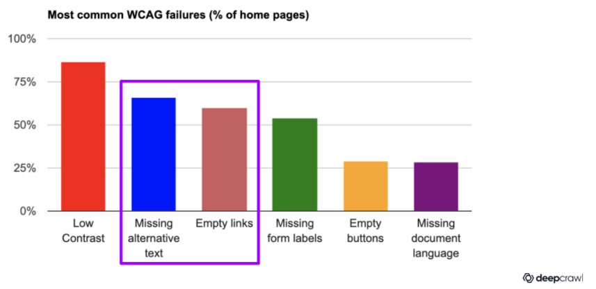
WebAIM’s data also shows that alt. text and empty links are the 2nd and 3rd most prevalent failures on home pages. Of course, these are two components of site architecture that are often the responsibility of SEOs.
Why should we care?
As we touched on in the introduction, site accessibility should be a consideration for developers and SEOs because it is really a human rights issue – and one that has only become more important as users around the globe have been affected by the Coronavirus pandemic.
Everett also points to the growing legal implications for sites that don’t ensure access for all. For example, both Dominos and Beyonce have been sued in recent years for bad onsite access.
SEOs also know that good UX is not only better for users, but it is also becoming increasingly important to Google (especially as they launch their Core Web Vitals algorithm update). On purely business impact terms, conversion rates go up when usability is better and good UX builds brand loyalty.
Takeaways: How can we test and improve our sites?
So how can we SEOs make accessibility better? Erudite’s Jessica James offers some great advice on how we can test and improve our sites across 5 key areas: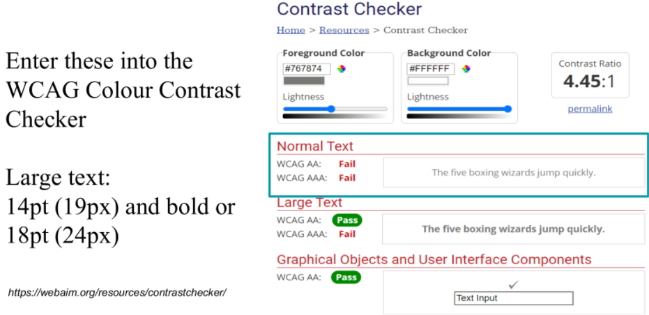
1. Colour contrast:
- The Paper Test. Simply take a piece of paper and place it over your screen. Can you still understand it? If you can, your color contrast settings are probably sufficient for users with some visual impairments.
- WAVE Chrome extension. Use this free tool to get at-a-glance insight into color contrast issues on your site’s pages.
- WCAG color contrast checker. Another free tool that gives color contrast grades (pass or fail) for the text/background of your site. Use the sliders to ascertain what would be a better contrast level for your text versus your background.
2. Ensuring images are accessible:
- Don’t embed text in images! It’s not good practice for SEO or screen readers. To discern whether text is HTML or not, can you highlight the text? Alternatively, if you open the image in a new window, is the text visible there too?
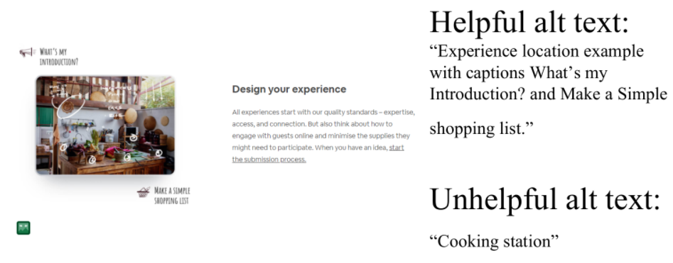
- Useful alt. text. Decorative images don’t need it, but functional or informational images (such as logos or icons) do. Consider how images appear without visual context.
- Automating alt. text. This can be done with Python. Check out Hamlet Batista’s great article about this.
- Alternatives to color-coding. Where possible don’t just use color coding to convey information. Patterns and cross-hatching can be better for color-blind users and those with visual impairments. Additional data tables also make this information more accessible.
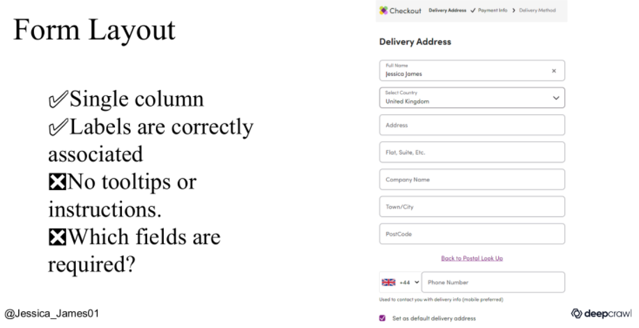
3. Ensuring forms are accessible:
- Layout. Keep forms to a single column and try to avoid unnecessary use of UI elements (such as sliders). Make sure clickable elements are big enough with sufficient inactive space surrounding them. And include visible form labels and tooltips.
- Useful instructions. Use tooltips where instruction fields could be ambiguous. But, importantly, make them clickable. ‘Hover only’ tooltips don’t help users using magnifying software.
- ARIA roles. These are useful for non-standard UI elements and useful for announcing changes (such as ‘item removed from cart’)
- Timing. Avoid the use of timers on checkouts or forms. These can be stressful for users and can stop conversions.
4. Ensuring navigation is accessible:
- Tab order. Is it logical? If not, use the tabindex attribute to specify a better one.
- Skip links. This allows users to skip main content without tabbing through everything else.
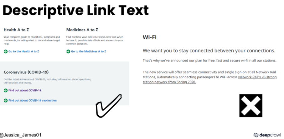
- Descriptive link text. Not all users can skim read!
- Active states. This means that when users are tabbing around a page, boxes are highlight clearly (with sufficient color contrast).
5. Other quick wins:
- Plain English copy. Avoid metaphors and jargon.
- Provide information in multiple formats. Transcriptions, closed captions, tables alongside graphs/pictograms.
- Zoomable pages. Is this easy to do or does text and image quickly become a mess? Consider mobile devices as well as desktops/laptops.
- Proper heading structure.