

Lumar’s dashboards comprise an Overview Dashboard, which gives information about all accessibility issues found on the site, and Level Dashboards for WCAG Levels A, AA and AA, plus additional best practice recommendations.
Overview Dashboard
The Lumar accessibility dashboards have been designed to give you a high level overview, with the ability to dive deeper into specific issues. This helps you easily spot the opportunities for improvement, and prioritize your work.
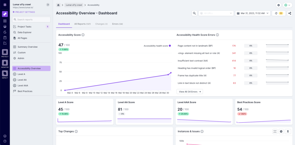
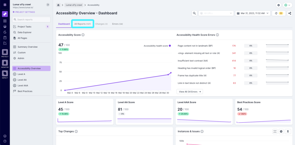
On the overview dashboard, you’ll see an ‘Accessibility Score’ at the top of the page. This is a score based on all the automated tests in the Lumar platform. It is important to note that for a site to be compliant, there are a number of manual tests that also need to be completed. While Lumar covers 100% of the automated tests, we recommend working with an accessibility consultant, like QualityLogic, to address the manual tests required for compliance.
To the right of the Accessibility Score, you’ll then see the top errors that are related to the overall score. You can click into each of these to get directly to the relevant report if required.
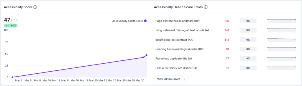
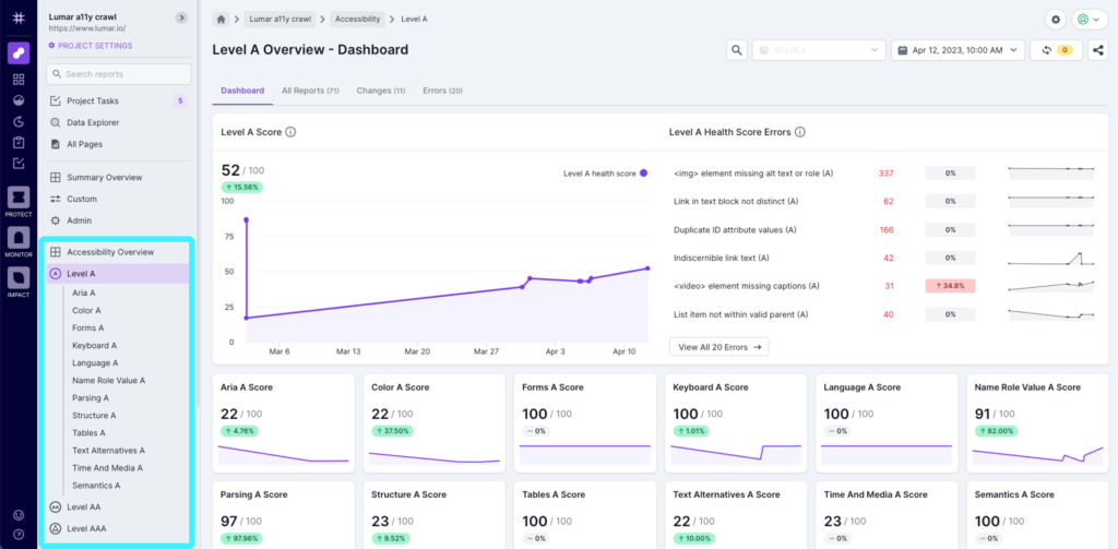
Underneath the Accessibility Score and Errors, you’ll see issues broken down into specific categories for WCAG 2.2 A, AA, AAA and some additional best practice recommendations.
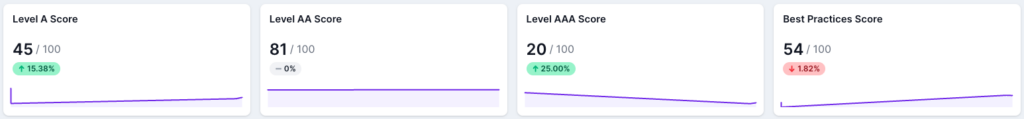
You can use these scores to see where you need to focus attention, based on the WCAG standard you are working to comply with. Level A is considered the bare minimum that websites should strive to achieve, while Level AA is the largely the level most legal requirements are based on around the world. Level AAA is considered the gold standard and something organizations are already aspiring to. The Best Practices are not related to any legal compliance, but provide additional tests and guidelines for further improvements. Clicking into a category will take you to the dashboard for that specific category.
Underneath the health scores section, you’ll see a number of charts that help you visualize the data in different ways. The first chart shows you the top changes from the previous crawl. This helps you quickly spot any spikes in issues that may have been introduced by recent code changes. Next to the top changes you’ll see a chart detailing the number of accessibility issues and the number of issue instances across your site.
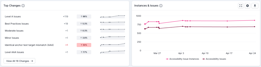
In the charts, clickable elements are available to take you to a relevant dashboard or report, or to highlight, remove or include certain elements. For example, in the ‘Instances & Issues’ report above, hovering over the legend at the bottom of the chart will highlight the particular area, and clicking on it will remove it and then reintroduce it to the chart.
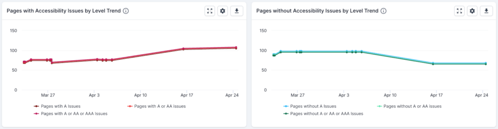
The next two charts will show you a trend line of the number of pages with and without accessibility issues, by level (A, AA or AAA). These can be used to see your overall progression, and also to show progress to key stakeholders.
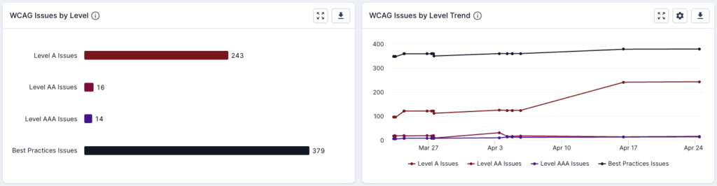
We then have a chart and trend to show WCAG issues by level, and the trend over time. Again, you can click through to the relevant dashboard from the chart.
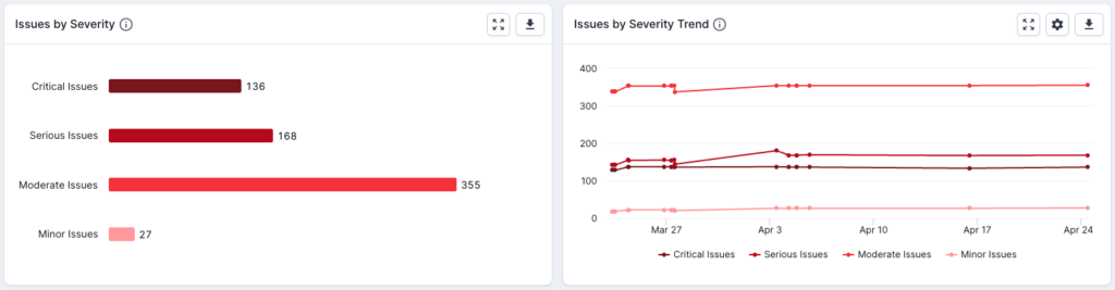
The next two charts will show you the issues by severity, so you can see the number of minor, moderate, serious and critical issues on your site.
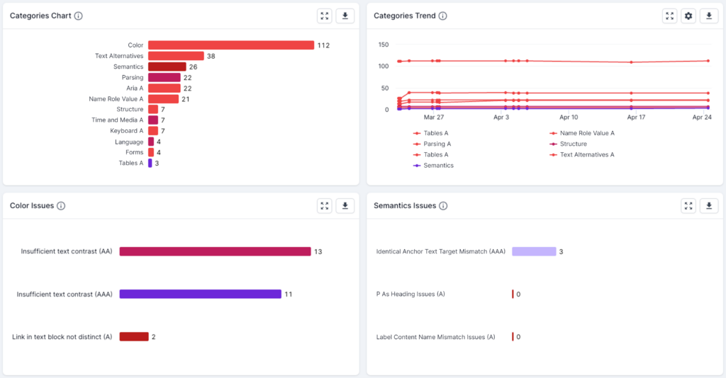
Underneath, you’ll then see charts and trends for specific categories, and categories that cover multiple levels (e.g. Color Issues across Level A, AA and AAA). In the dashboards for each level, you’ll see the categories specific to that level, but this gives you the ability to see the category across levels in one place.
WCAG Level Dashboards
The level dashboards are laid out in the same way as the overview dashboard, so you’ll see the overall score for the level and the top errors for that level at the very top, and then scores for specific level categories underneath. This allows you to see exactly which issues are bringing your score down, and again allows you to prioritize your work accordingly.
Underneath the health scores, you’ll then see charts and trends for categories and issues specific to that level. As mentioned, you can drill down into the data by clicking through from the dashboards to lower levels. You can also use the left hand navigation to move to different areas as required.
Working with the Accessibility Reports
Lumar’s accessibility reports are logically grouped into the WCAG levels and categories, to make finding the information you need as easy as possible.
Accessibility Reports
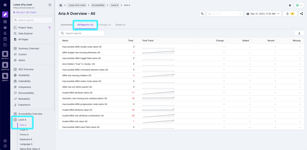
You can see all of the reports in one place by clicking on ‘All Reports’ above the accessibility score on the accessibility overview dashboard.
Each category then has a set of reports in it. For example, in the Level A > ARIA A section, you’ll see reports covering issues for screen readers related to Level A of the WCAG guidelines.
At the top of each report, you’ll see an option to ‘Show Help’ at the top, next to the title of the report. Clicking this will open up some guidance on the issues within the report, to help you understand the priority and the impact that fixing the issue will have. Once you’ve got the details you need, you can hide the help again.
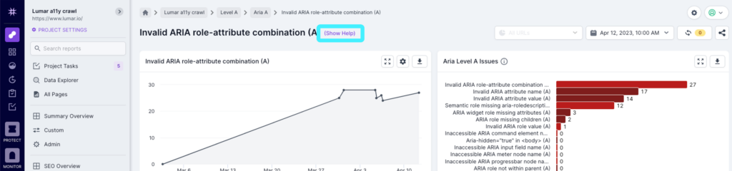
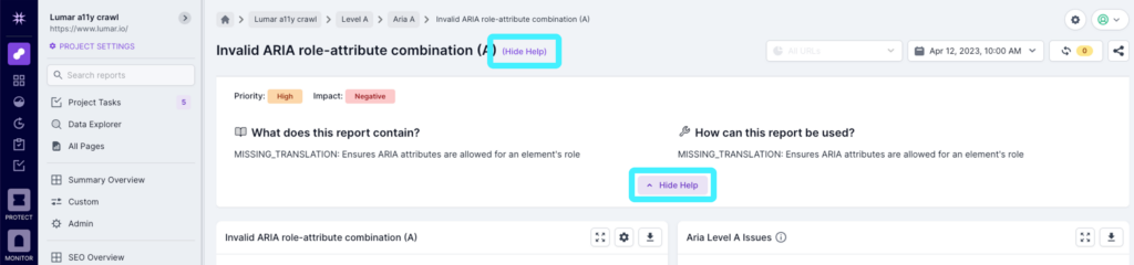
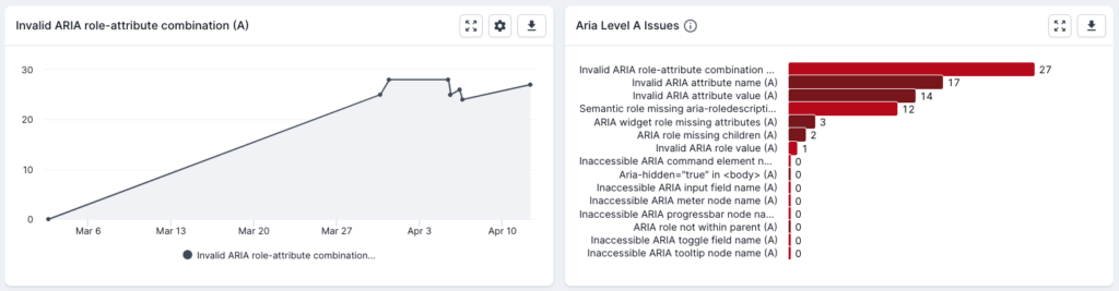
At the top of the report, you’ll see two charts. On the left, you’ll see a trend graph for the issue, so you can see progress and see any spikes related to the issue. On the right a bar chart shows you the other issues within the same category (e.g. Aria A) with the number of URLs affected, from the most instances to the least. This allows you to quickly navigate between the reports as required.
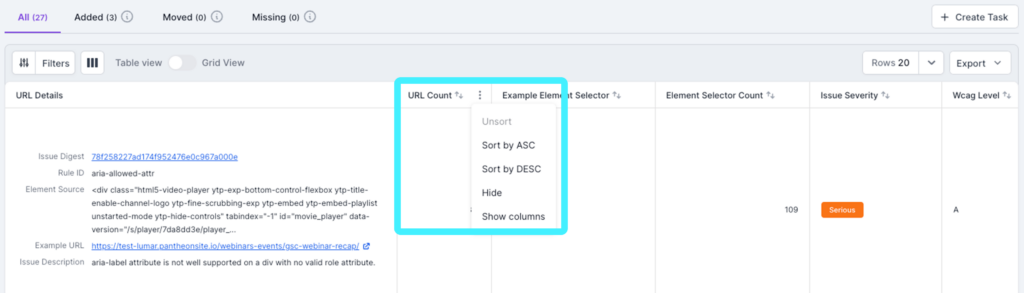
Underneath the charts, you’ll see the report table which details each issue in a separate row. The columns that appear in the table will depend on the report you’re in, but will generally include the following:
- URL Details – Here you’ll see details of the issue, including:
- Issue Digest – This is a link that you can click on to get more information (see below).
- Rule ID – The accessibility test that found the issue.
- Element source – The specific source code on the page that has the problem.
- Example URL – An example page that has the issue.
- Issue Description – A description of the issue that has been found.
- URL Count – The number of URLs that this issue has been found on.
- Issue Severity – The severity of the issue from the WCAG guidelines.
- WCAG Level – Which level of the WCAG guidelines the issue relates to.
- WCAG Success Criteria – The reference of the success criteria from the W3 website.
Within the table, you can drag and drop the columns into a different order, and clicking on the ellipses gives you the opportunity to sort by ascending or descending, hide the column, or show columns so you can add in any others that you want to.
You can also add and remove columns by using the columns button at the top of the table.
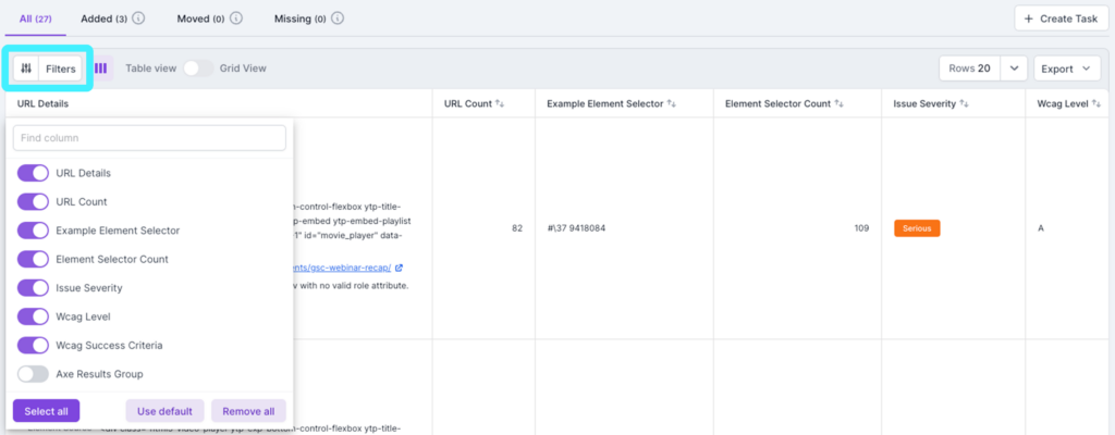
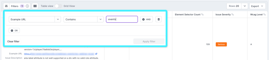
At the top of the table, you’ll also see the option to filter the report. Simply click on the ‘Filters’ option and choose the filter criteria using either a single rule, or multiple rules using ‘And’ or ‘Or’ options. Once you’ve chosen the filters you need, just click apply filters. Once this is complete, you’ll see a number to the right ‘Filters’ to show how many filters are applied to the table.
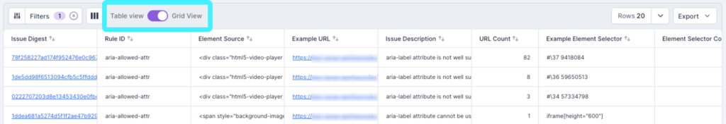
To the right of the filter options, you’ll also see a toggle between a ‘Table View’ and ‘Grid View’. By default, you’ll see the table view, which has the URL details aggregated into a single cell. Switching to the grid view will split this information out into different cells.
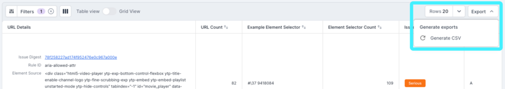
On the right hand side of the table header, you’ll see an option to increase the number of rows seen in the table. Next to that, you’ll see an option to export the information to CSV. When exporting, any changes you’ve made to the columns (i.e. reordering or adding columns) and any filters you’ve applied will be reflected in the CSV download. Just click to generate the CSV and the file will download. You can also return here to regenerate or redownload the file if required.
Filtering Reports by Traffic
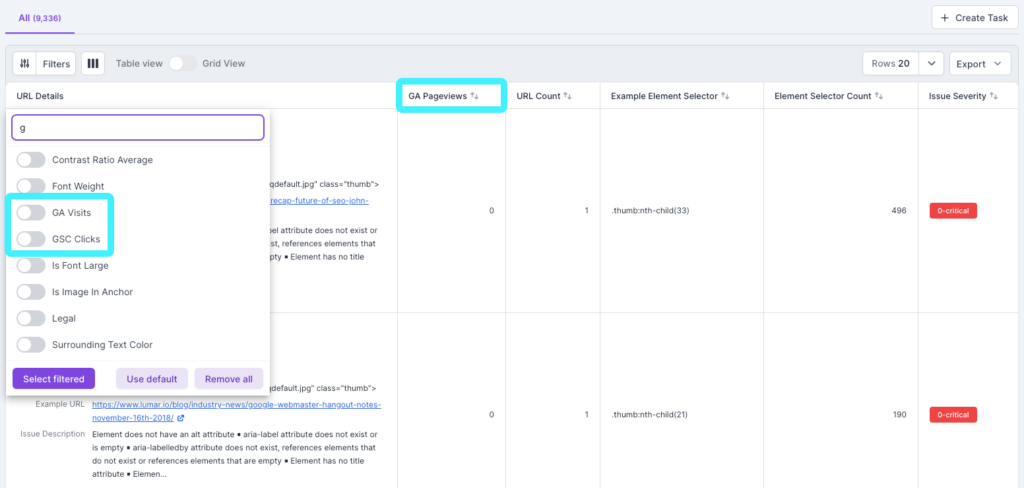
With Lumar, you can also filter reports by traffic, so you can focus your attention on the most important pages—those that are getting the most amount of visitors. To enable these metrics, you will need to have Google Analytics connected to the Lumar platform, and also connect Google Search Console to Lumar.
With Google Analytics data pulled into the Lumar platform, the following new aggregated metrics will then be available as columns in reports:
- GA Page Views – Aggregated page views from Google Analytics
- GA Visits – Aggregated visits from Google Analytics
- GSC Clicks – Aggregated clicks from Google Search Console
These new metric columns will behave in the same way as other columns in the reports, so they are sortable, filterable, etc.
With these metrics in place, the default layout of reports will change slightly. Every report will now have the Aggregated GA Page Views column, and issues will be sorted by the value by default. If Google Analytics is not connected, reports will be sorted by URL count by default.
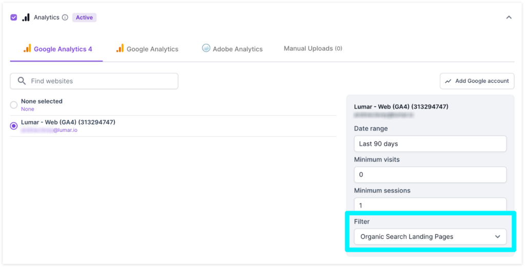
Currently, the ‘Filter’ option when setting up Google Analytics as a source in the crawl setup will default to Organic Search Landing Pages. For accessibility, you should set this to ‘All’ by selecting from the dropdown. We will soon be updating this, so it will default to ‘All’ for accessibility crawls.
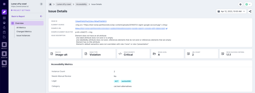
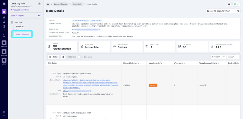
Issue Details Page
As mentioned above, the Issue Digest link in the URL Details cell of the table will take you to the Issue Details page. Here you’ll see the key information for the issue from the table, along with some additional information, such as whether the issue needs manual review or if the issue relates to any specific legislation.
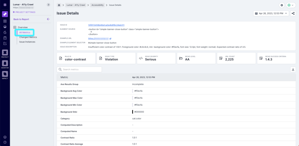
From here, you can also see ‘All Metrics’, which will show you all of the accessibility metrics in the Lumar platform, with any values that are relevant to the issue you’re looking at.
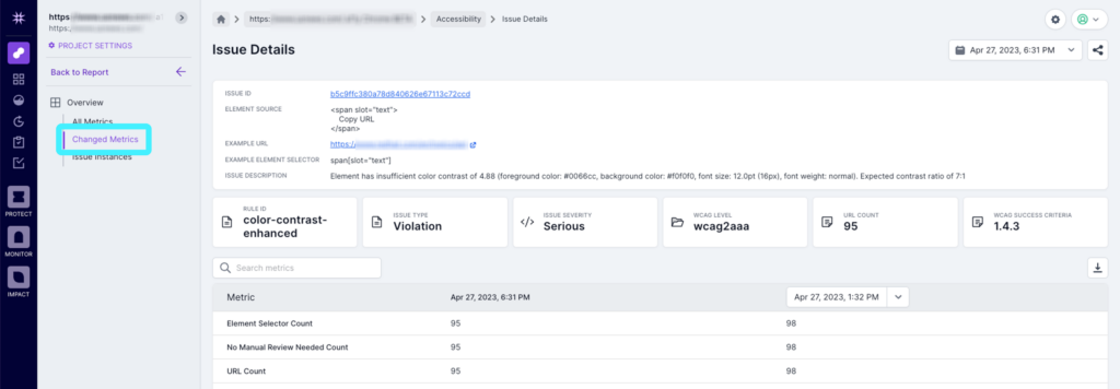
If you click on ‘Changed Metrics’ you’ll also see anything that has changed from the last crawl.
And finally, by clicking on ‘Issue Instances’, you can see all of the instances of this particular issue in the same format as the report table, but this time with each row representing a single instance on a unique URL. You also have the option to filter, switch to the grid view, change the number of rows and export data, just like on the issue report table.
The instance reports all have a similar structure, but some will have different data points. For example, for color contrast, you’ll see the following data:
- Contrast Ratio
- Font Size
- Font Color
- Font Weight
- Is Font Large
- Background Min Color
- Background Max Color
With this data, Lumar’s proprietary algorithm is able to drastically reduce the number of unresolved issues, saving you time and allowing you to focus on core issues.
Next Steps
Now you’ve got to grips with the accessibility metric reports in Lumar Analyze, you can start to create and manage tasks in the platform.


