

Chapter 4: Internal Linking Optimisation
One of the best methods for keeping important pages within easy reach of both users and search engines is with a clear navigation. Global navigation or mega menu links are weighted more heavily than other types of links, so they need to be used with great care. In this section of the guide we’ll discuss how to implement an effective navigation and the different methods you could use.
For users starting from a website’s homepage, the navigation will set out the most important pages on the website and help them to get there easily. For users landing on any other page, the navigation will still be able to orientate a user to the website’s overall content offering and keep them moving forward in their journey to achieve their intent.
A user should never have to go “back” in order to go forward. So make sure your navigation and categorical pages are available from every page, especially knowing for organic search, a user will enter your site and the journey at every level.
A website’s navigation acts as the anchor which keeps a user from being swept away by all of the different pages on a website and getting lost.
Here are some of the most common ways of structuring the navigation of a website, featuring examples by Caleb Cosper:
- Single-Bar Navigation
- Double-Bar Navigation
- Dropdown Navigation
- Double-Bar Dropdown Navigation
- Dropdown Navigation with Flyouts
- Mega Menus
- Responsive Subnav Menus
- Secondary Left Navigation
- Footer Navigation
Single-Bar Navigation
The single-bar navigation contains all of the navigation links within one row.
Pros:
- The items are easily crawlable for search engines.
- The links are clear for users, with no risk of them getting buried.
- A minimal number of links means link equity isn’t spread too thin.
Cons:
- There is a very limited number of links you can include.
- Only a small website taxonomy can be presented to users.
- Topic grouping is limited without dropdown options.
Double-Bar Navigation
The double-bar navigation features links on two separate rows. They can either be defined as the primary and secondary navigation, or can both be categorised as the main global navigation.

Pros:
- There is more space to include links.
- Key pages are still clearly outlined to users.
- More of the website’s taxonomy can be presented than in the single-bar navigation.
- There is still a small amount of items linked so link equity isn’t diluted too much.
Cons:
- Double-bar navigation design can appear cluttered.
- Topic grouping is limited without dropdown options.
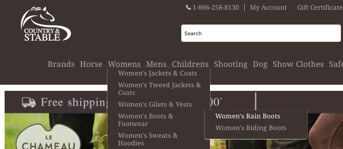
Dropdown Navigation
The dropdown navigation contains lists of links which appear vertically underneath each main category when clicked on or hovered over.
Pros:
- A dropdown navigation can include many more links than a single or double-bar navigation.
- Taxonomies and page groupings can be clearly displayed for users.
Cons:
- The links within the dropdown menus may not be crawlable or indexable if they’re not included within the page’s HTML and are coded with JavaScript, for example.
- Be aware that the ‘hover’ action doesn’t work for users on touchscreen devices.
- Link equity can be spread too thinly if too many links are included.
Double-Bar Dropdown Navigation
The double-bar dropdown navigation is similar to the standard dropdown navigation, but the dropdown menus appear on two different rows.

Pros:
- More links and subcategory pages can be included.
- There is more space to map out the taxonomy and page groupings of a site.
Cons:
- Unless the dropdown is coded properly, the top dropdown might not detract and could block the bottom dropdown.
- Link equity could be spread too thinly as this method could include twice as many links as the traditional dropdown navigation.
Dropdown Navigation with Flyouts
The flyout menu is a version of the dropdown navigation which works horizontally after the initial list of URLs has appeared. The submenus will ‘fly out’ when an item is clicked on or hovered over.
Pros:
- The hierarchy of content is displayed clearly.
- More links to categories deeper in the architecture can be included.
Cons:
- Links can be hidden from search engines if they aren’t coded in HTML.
- Users can find flyout navigations frustrating to use as the whole menu will often disappear if the mouse moves away from the list items.
- Users with tremors or impaired dexterity may not be able to use flyout navigation at all.
- The ‘hover’ action isn’t possible for users on touchscreen devices.
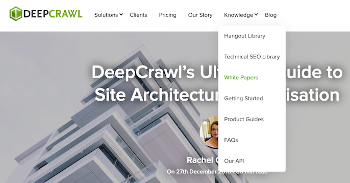
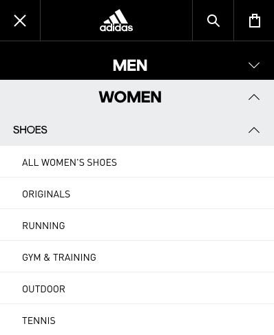
Mega Menus
A mega menu is a dropdown which shows a number of different subcategory lists all in one area when a top category is clicked on or hovered over.
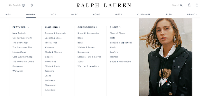
Pros:
- Users are able to get a better sense of of your website’s range and content offering.
- Can include a large number of links to related pages.
- There is space to include images to further convey the context of a category to users.
Cons:
- Users can be overwhelmed by too much choice.
- Mega menus don’t work well on mobile devices due to limited space on the screen.
- Mega menus should only be used if a website has enough useful categories or content to populate them.
- Search engines may not be able to crawl and index these links if they’re not served in the HTML.
- When used incorrectly, mega menus can flatten site architecture too much and reduce the ability to create a hierarchy of content.
Linking to every page from a site’s homepage will stop Google from understanding a site’s architecture.
-John Mueller, Google Webmaster Hangout
Oh gosh, totally dependent on the site. But a few key principals:
1. Mega menus should really only link to top performing pages, not every page. Trim the cruft
2. Should be used for navigation, not promotion
3. Group links by topic
4. Can work well, especially for authority sites— Cyrus (@CyrusShepard) November 9, 2018
Responsive Subnav Menus
Responsive subnav menus use toggle icons to allow a user to expand and collapse particular items vertically within the same list.
Pros:
- Responsive subnav menus can work well on mobile devices.
- Having submenus listed in one place allows users to survey the whole landscape and taxonomy of the site.
Cons:
- Users may not know that the menu items are expandable unless there is a clear icon or visual cue.
- With more subcategories displayed, the remaining categories will be pushed further down below-the-fold.
- Collapsing an expanded list isn’t always intuitive and can cause a negative user experience.
Secondary Left Navigation
A secondary left navigation works as a way of helping users navigate between related topics or pages within a set. The links are displayed vertically, with the option for expandable and collapsible subnav menus to be included as well.
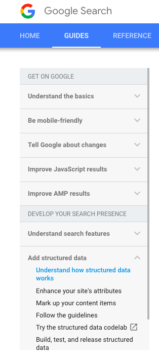
Pros:
- Works well on article or guide pages to split up long pieces of content into more navigable sections.
- Gives clear guidance to users on what page they’re on and which page is ‘next’ in the series.
Cons:
- The links may not be crawled or indexed by search engines if they’re not served in the HTML.
- Including too many links in the navigation as well as having a large mega menu, for example, can spread link equity too thinly.
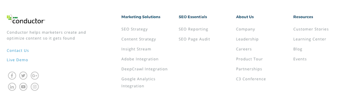
Footer Navigation
The footer navigation includes lists of links at the bottom of a page’s template. This section is usually used to highlight company information.
Add links to site footer that are useful for users not Google.
-John Mueller, Google Webmaster Hangout
Pros:
- More space to include additional links to key pages.
- Provides users more options for discovering your pages.
Cons:
- Links to important pages should be included above-the-fold so users can find them easily. Users may not get to the bottom of a page to see these links.
- Footer links are devalued by Google.
- Including too many footer links can be seen as manipulative.
Whichever navigation methods you use, make sure to test them to make sure that search engines will be able to crawl your pages effectively and that users are able to navigate your site with ease. Use a crawling tool and an analytics tool to measure this, and use a CRO tool with click mapping or session recording functionality as well if you have access to one.
Test navigation models to reduce click depth and improve UX.
-John Mueller, Google Webmaster Hangout
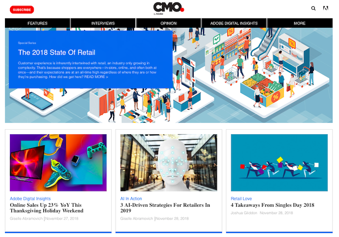
How to utilise hub pages
Hub pages are commonly used as a way to answer users’ questions by providing a central resource for them to navigate between relevant and contextually linked content. Once you’ve done the research into who your users are and what they find engaging, you can create compelling hub pages that will increase user experience because they allow users to explore content topically.
A hub page is based on one main page and supplementary pages. These supporting landing pages will be featured and linked to from the main hub page and will dive deeper into the main topic. It’s recommended to link back to the hub page from the supplementary pages to show their connection clearly to search engines and provide strong signals on the relation between the pages. This will demonstrate that the hub page is the most authoritative resource on that particular topic, which will make things more straightforward when it comes to rankings.
If you have a variety of different articles on a similar topic, this may cause confusion when deciding which one to link to internally. This is where the hub page comes in; to provide a core page to link to internally, which will also give that page more chance of ranking by consolidating your efforts into one place.
Hub pages also help to better distribute linking authority across topically relevant pages rather than just those that are newest, or however a website presents its content by default.
Blogs work like a conveyor belt, constantly giving the most internal link equity to the newest content and removing it from older articles.

Content hubs help users get off the never-ending conveyor belt of chronological articles and explore the content they want to see in their own time.
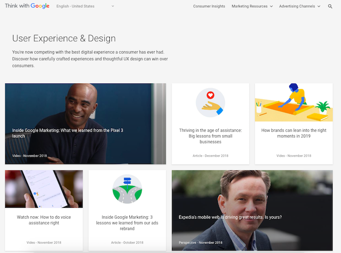
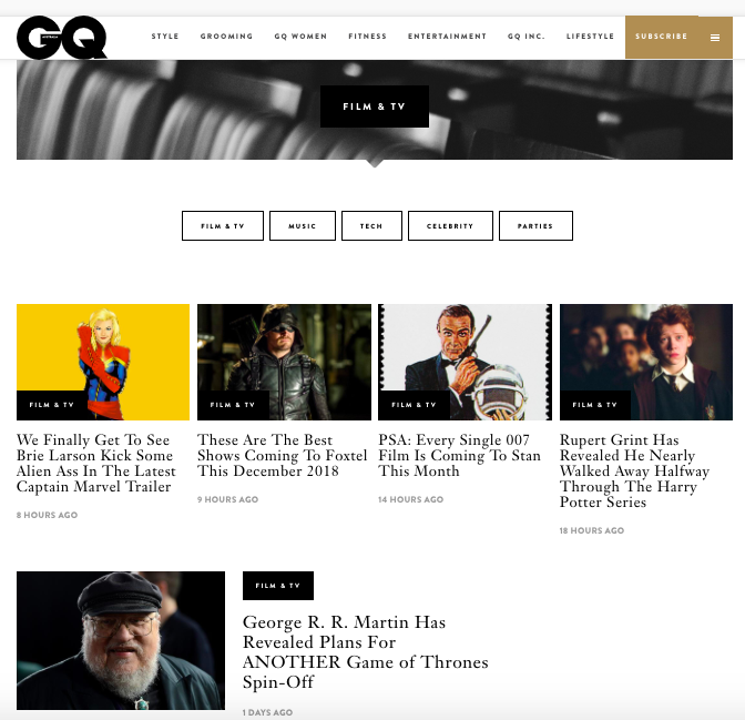
Here are some examples of how brands are utilising hub pages:
These are some of the key things to consider for creating a successful hub page:
- Avoid straying too far from the core topic with the content and links you’re including.
- Link to your hub page from the homepage or main navigation to make it more findable for users and search engines.
- Hub pages must make sense for both users and search engines.
- Ensure your hub page stays relevant by adding new, valuable content whenever possible so Google sees it as an up-to-date resource.
- Include an internal search box somewhere on your hub page to improve UX and provide invaluable data on what your customers are looking for. This is just one of the ways in which you can leverage internal site search data.
Conclusion
It’s clear that the websites that structure their pages to suit the expectations of users in a way that is understandable and crawlable for search engines, are the ones that succeed. A successful site architecture focuses on matching user intent at all times, as well as increasing the findability of the most important pages on a website by keeping them high up in the overall site depth.
One of the most important things to be mindful of is that site architecture optimisation should be an evolving process. If you have mapped out the different page types that are needed on your website, categorised them with information architecture best practice and user insights in mind, and internally linked them together to maximise the findability of key pages, that’s brilliant.
However, your business, your customers and the search engines themselves will develop and change over time, and the site architecture implementation you have now may not work as well further down the road. You need to continually assess your business objectives, the content you need to both fulfil those objectives and engage your target audience, as well as how to structure those pages for smooth user journeys and efficient search engine crawling.
Access the Downloadable PDF Version of this Guide