

Core Web Vitals is currently the buzzword in the Tech SEO community, as the May 2021 Page Experience update approaches.
But how do you prepare?
There are a ton of resources online for finding and proposing fixes to LCP, CLS, and FID issues, but how do you prioritize them in terms of your overall strategy?
Are these the most important elements to focus on, or are there better ways to spend your limited development and product resources?
I’d argue that before even digging into your site’s LCP, CLS, and FID scores, you should take a look at your competition. And you should be regularly checking in on how your competitors are doing on page performance.
Thankfully, Google has made this extremely easy to accomplish with the Chrome User Experience Connector in Google Data Studio. There is a template that Rick Viscomi and Minhaz Kazi created that shows metrics for your site, but the team at Lumar has developed a competitor comparison dashboard that allows you to compare your field data metrics to your competitors.
Google updates the CrUX dataset monthly, so each month this dashboard will automatically update with the past month’s data. This means that in addition to your initial analysis you can use the dashboard as an ongoing monitoring tool.
Unsure of what CrUX data is and how it fits into the performance conversation? Need a refresher on lab versus field data? There’s a ton of fantastic content out there, but “When SEO meets UX: The upcoming page experience ranking signal” by Jamie Indigo is my favorite primer.
Once you’re familiar with what CrUX data is and understand why it’s so useful, let’s build this dashboard!
CrUX Competitor Dashboard Template Overview
Our clients have loved this dashboard so much that we’ve decided to share it with the community! So let’s get started! There are eight pages in our template:
- Page Speed Trends – Client
- Page Speed Trends – Competitor 1
- Page Speed Trends – Competitor 2
- Page Speed Trends – Competitor 3
- Page Speed Trends – Competitor 4
- Good CrUX Competitive Speed Comparison
- Needs Improvement CrUX Competitive Speed Comparison
- Poor CrUX Competitive Speed Comparison
Why only four competitors? Well, the last three slides depend on data blending, which is limited to 5 data sources at this time.
Pages 1-5 Overview
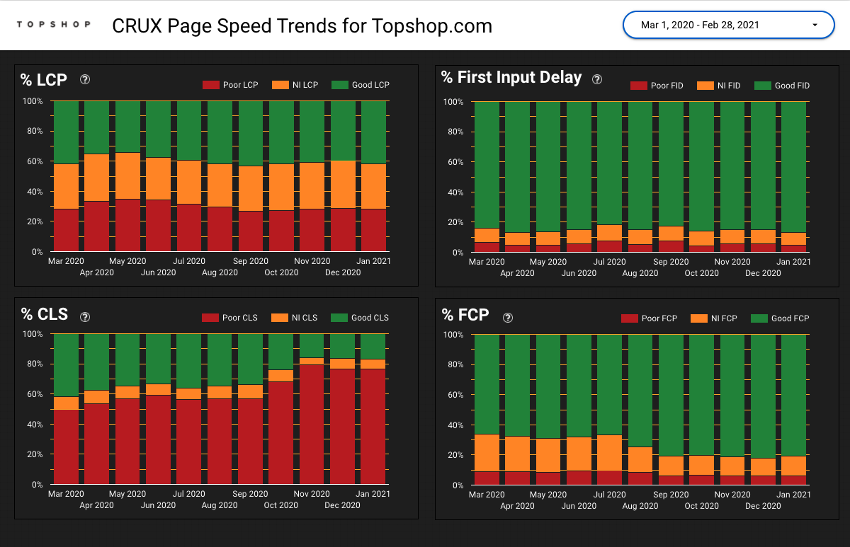
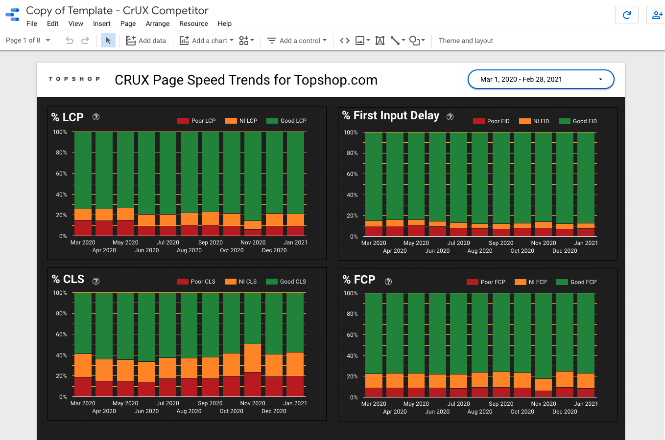
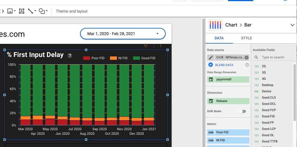
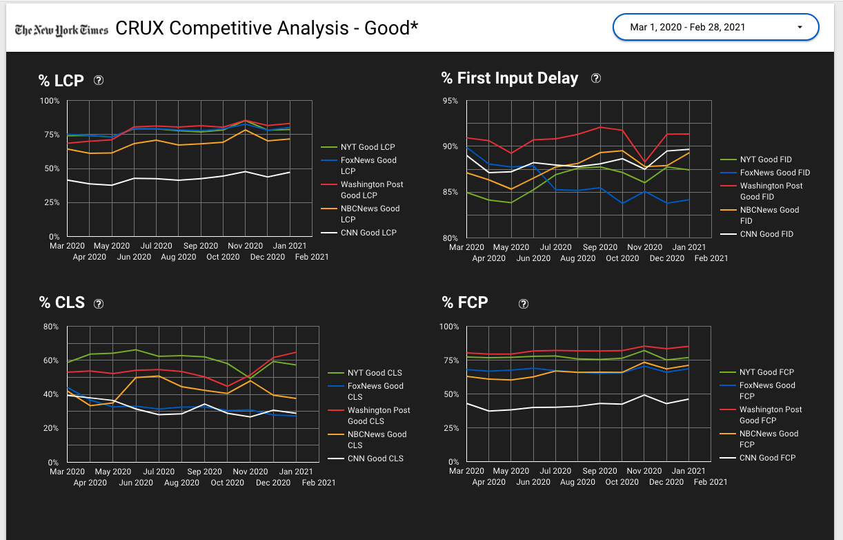
Pages 1-5 highlight the same 4 performance metrics over time, for you and your competitors: Largest Contentful Paint, First Input Delay, Cumulative Layout Shift, and First Contentful Paint. The first three are Core Web Vitals metrics. First Contentful Paint was included because it was the most commonly requested additional performance metric from clients.
Pages 6-8 Overview
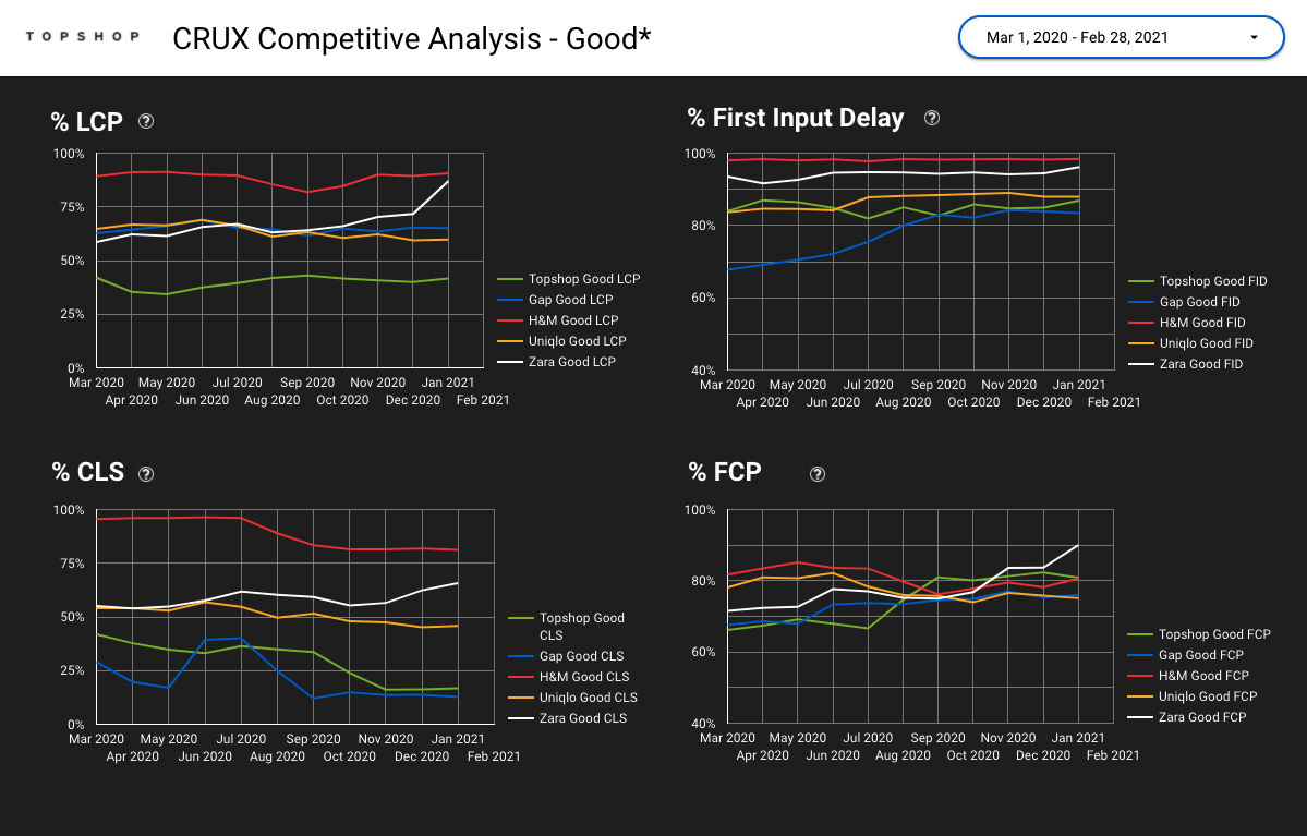
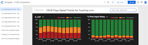
Pages 6 through 8 highlight the comparison between your client and their competition for the same four performance metrics: Largest Contentful Paint, First Input Delay, Cumulative Layout Shift, and First Contentful Paint, broken down between good, average (needs improvement), and poor.
These pages help our team identify which metrics should be prioritized in performance recommendations. For example, if Topshop was my client, my focus would be on LCP followed by CLS. Seeing trends over time also helps identify dates in the past year where website updates have positively or negatively impacted performance.
How to Create Your Own CrUX Competitor Dashboard
You want to create your data sources before copying a template. I’ll say it again: create your data sources before copying this template. It’s going to make your life 1000x easier.
Creating the Data Sources
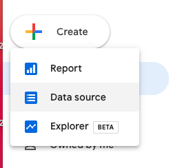
Step 1: Go to the overview page of Google Data Studio and select “Create” from the left navigation. Choose “Data Source.”
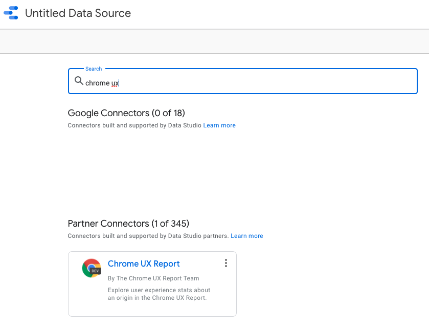
Step 2: Search for “Chrome UX” and select the connector.
Step 3: Enter the homepage URL in the box that says “Enter origin URL.” I recommend visiting the homepage and copying and pasting this URL, as the connector is very sensitive. Give the data source a unique name and then save it.
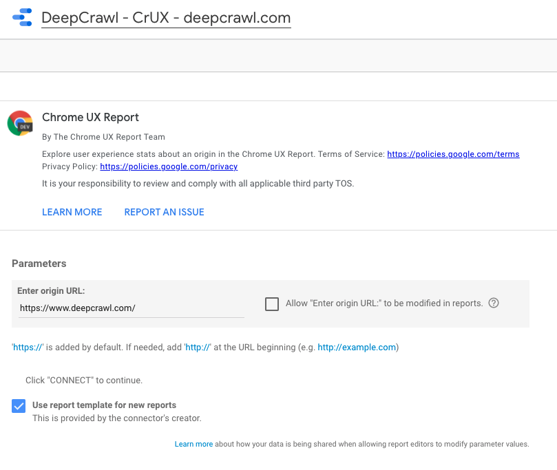
You should end up on a page that looks like this:
Step 4: Select the GDS icon in the top left to go back to the GDS overview page.
Then repeat steps 1 through 4 for each of your competitors.
Copying the Dashboard Template
Now that the data sources are created, let’s create a copy of the template that is updated with our data sources.
Step 1: Go to our template page.
Step 2: Select the copy icon from the top navigation bar.
A popup will appear that asks you to select your new data sources for the copy.
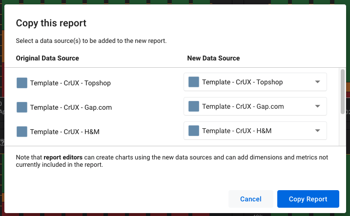
Step 3: Use the dropdown menu to select the data sources that you just created as your new data sources. Please note that two of the data source options require you to scroll down within the popup. Also, if you don’t see your new data sources, refresh the template page and try copying again. It takes a moment for GDS to recognize new data sources, so sometimes there is a bit of a delay.
Step 4: Press “copy report” and your new report will open!
Customizing the Dashboard Template
You’re probably wondering why everything looks the same – that’s because we’re going to need to do some work to customize the dashboard.
Step 1: Rename your dashboard to something meaningful. I chose “Major US Publisher – CrUX Competitor,” but you’ll probably want to include your client’s name and that it’s a CrUX Competitive Dashboard.
Step 2: Change out the logo – this will update on every page of the dashboard. To do this, select the logo on a page, click on the item listed in “image file” and update this to the desired logo file saved on your computer. I’m pretending that the New York Times is my client in this case, so I’ve added their logo. You may need to do some resizing to make everything look nice.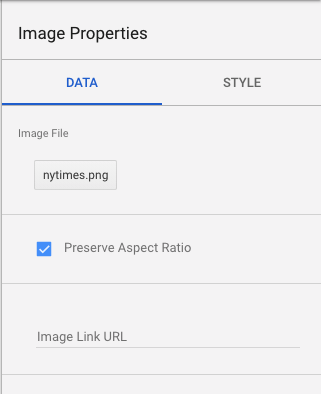
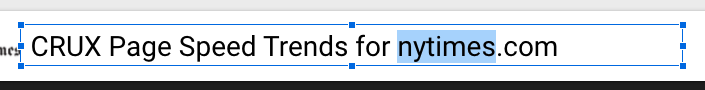
Step 3: Update the sidebar names and dashboard page names to match data sources. To update the names on the dashboard page, just select that page element and update the text inside.
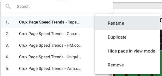
To update the sidebar, select the dropdown, choose the three-dots icon on hover, and choose “rename.”
If you’re unsure which data source is on each page, select a chart on the page and see which data source is connected to that page. The order should match the order that you copied them into the report in step 3 of “Copying the Dashboard Template.”
Data Blending Edits
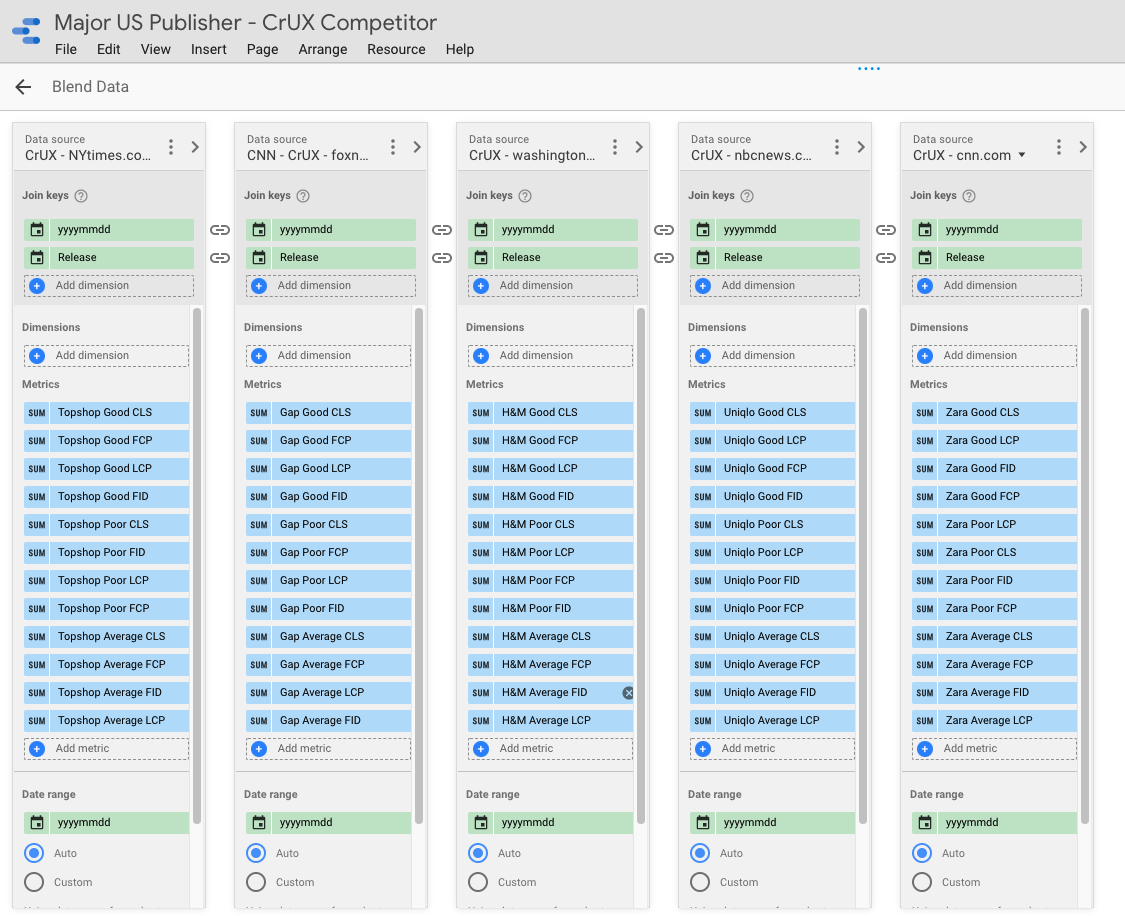
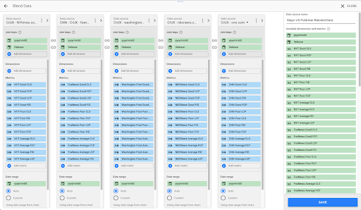
When you go to pages 6-8, you may panic – WHY do these still show the template competitors?!? Don’t worry, the data is correct, but the naming is wrong. We’re going to rename the data blending fields to match our new dashboard.
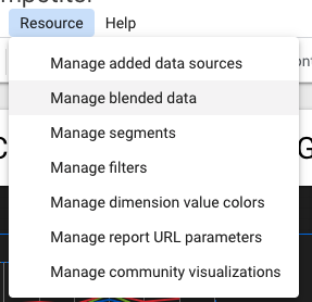
Step 1: Under resource, select “manage blended data” and then choose “edit” on the “Topshop Blended Data” resource.
Notice that the data source names match what you intend, but the metrics are named incorrectly. We’re going to fix this!
Step 2: Put on some good music, because you’re about to do some tedious renaming work.
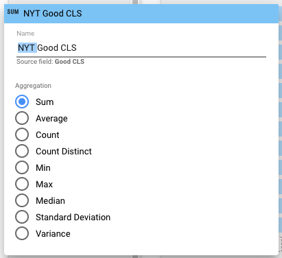
Step 3: Choose the pencil icon that appears on a metric when you hover over the “SUM” portion. You should see this:
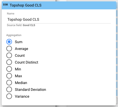
Alright, all we need to do is rename the brands to match the data source. In this case, NYT.
Step 4: Rename every field to match your new data sources. A helpful way to speed this up is by copying and pasting the brand name into each field. That’s about the only way I’ve found to speed this up. At the end, it should look something like this:
Step 5: Press save and then close.
Congratulations! You have a working GDS Competitor CrUX dashboard. I’d recommend checking up on each of these charts to make sure the correct data is showing in each, but if you followed these instructions, everything should be correct.
Two Special Cases
The basic template provides extremely valuable information for clients, but our team has also adapted it to meet special use cases. I’ll go over two use cases I’ve found valuable.
I have many verticals with unique competitors
So let’s say your client has competitors in different verticals and wants pages for each vertical. Tedious, but easy!
Step 1: Create more data sources for these competitors.
Step 2: Make a copy of the blended data source and update it to match the new competitors.
Step 3: Copy the last three dashboard pages.
Step 4: Update the data source on those three pages to your new blended data source.
Incorporating Lab Data with CrUX Field Data
What if you want to be able to see lab metrics alongside field data metrics? Well, there are complicated ways to do this with the Lighthouse Node.js library and BigQuery. You could also manually check with Lighthouse and add this in a Google Sheet that is used as a data source for GDS. Both of those options sound like a lot of work!
If you’re a Lumar customer with JavaScript rendering, you have the ability to pull in Largest Contentful Paint and Cumulative Layout Shift lab data metrics for every page on your site. Pair this with segmentation and you can find average LCP and CLS scores for each template of your site and monitor them over time. Lumar has a Google Data Studio connector too, so pulling in your performance lab data alongside CrUX averages for the site is simple! Check out the Lumar example template page on performance metrics to get a feel for how you can visualize lab data in GDS in addition to CrUX field data.
So What’s Stopping You?
See how you stack up on performance metrics against your competition and start tracking your CrUX data today!
Want to learn more about Core Web Vitals? Download our Complete Guide to Core Web Vitals
Want to find out how Lumar can help you prepare for May’s big update? Book a demo